—
Noris Cocci
Website and shop
Graphic design · WordPress · WooCommerce
—
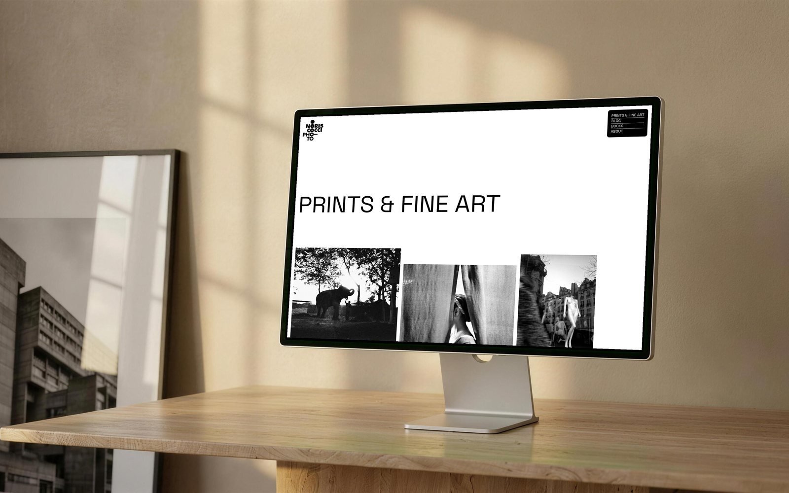
Noris Cocci is a photographer, and noriscocci.com is the place where he keeps together what he publishes: the fine art prints for sale, the books, the blog and his biography. I did the graphic design, built it on WordPress and set up the shop with WooCommerce. It is the fourth job we have done together after three books.
The entrance
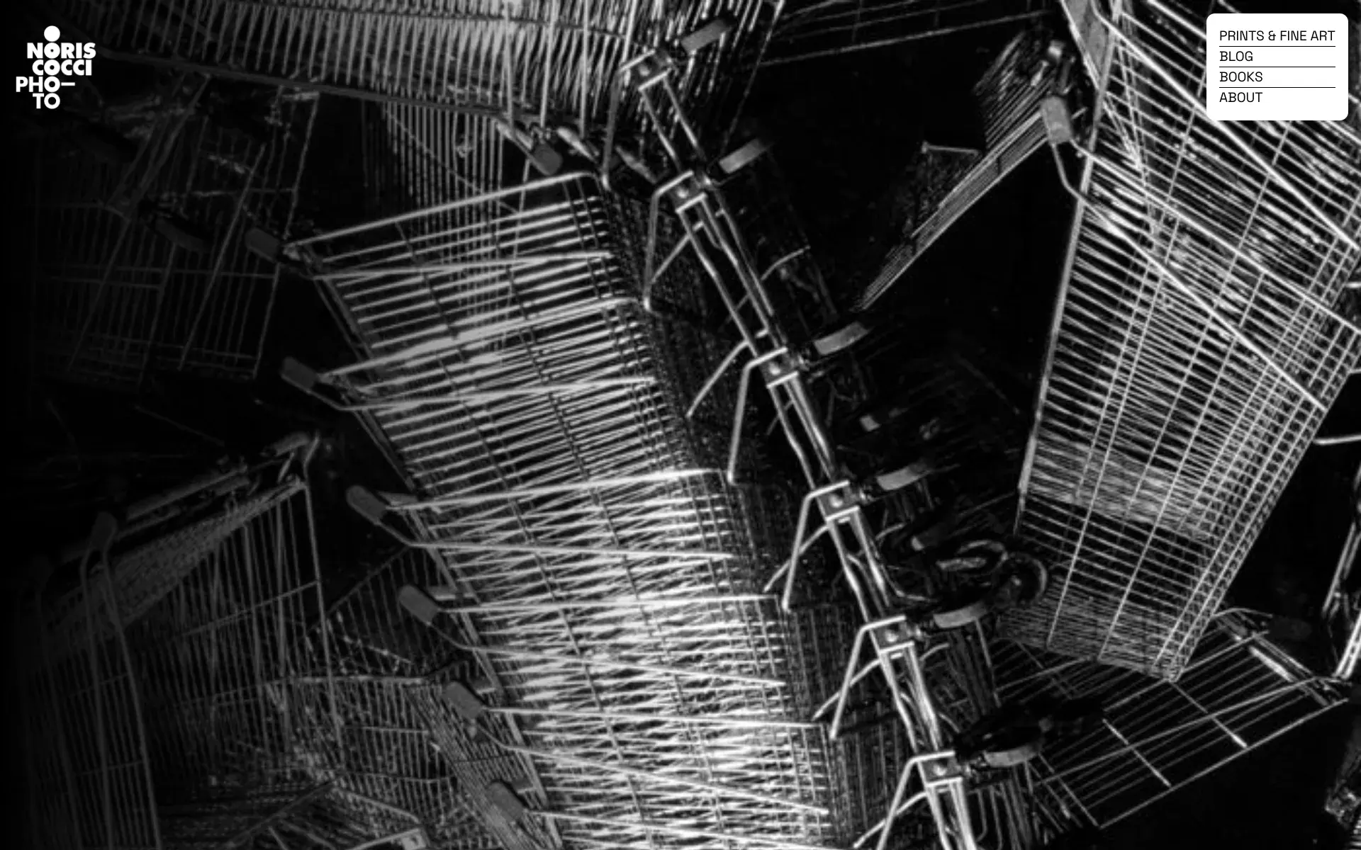
The first page is not a list of sections: it is a single full-screen photograph, with only two things on it, the mark and the menu. At the bottom stays the sentence with which the author introduces himself. Whoever arrives sees a photograph as big as the screen before seeing an interface, which on a photography site seemed to me the right way to begin.
The staggered grid
In the inner sections the images are not lined up in columns: each row carries two or three of different formats, staggered vertically, with a lot of white between one and the next. The proportions are decided by the photograph, not by the grid: verticals stay vertical and none is cropped to make the row add up.
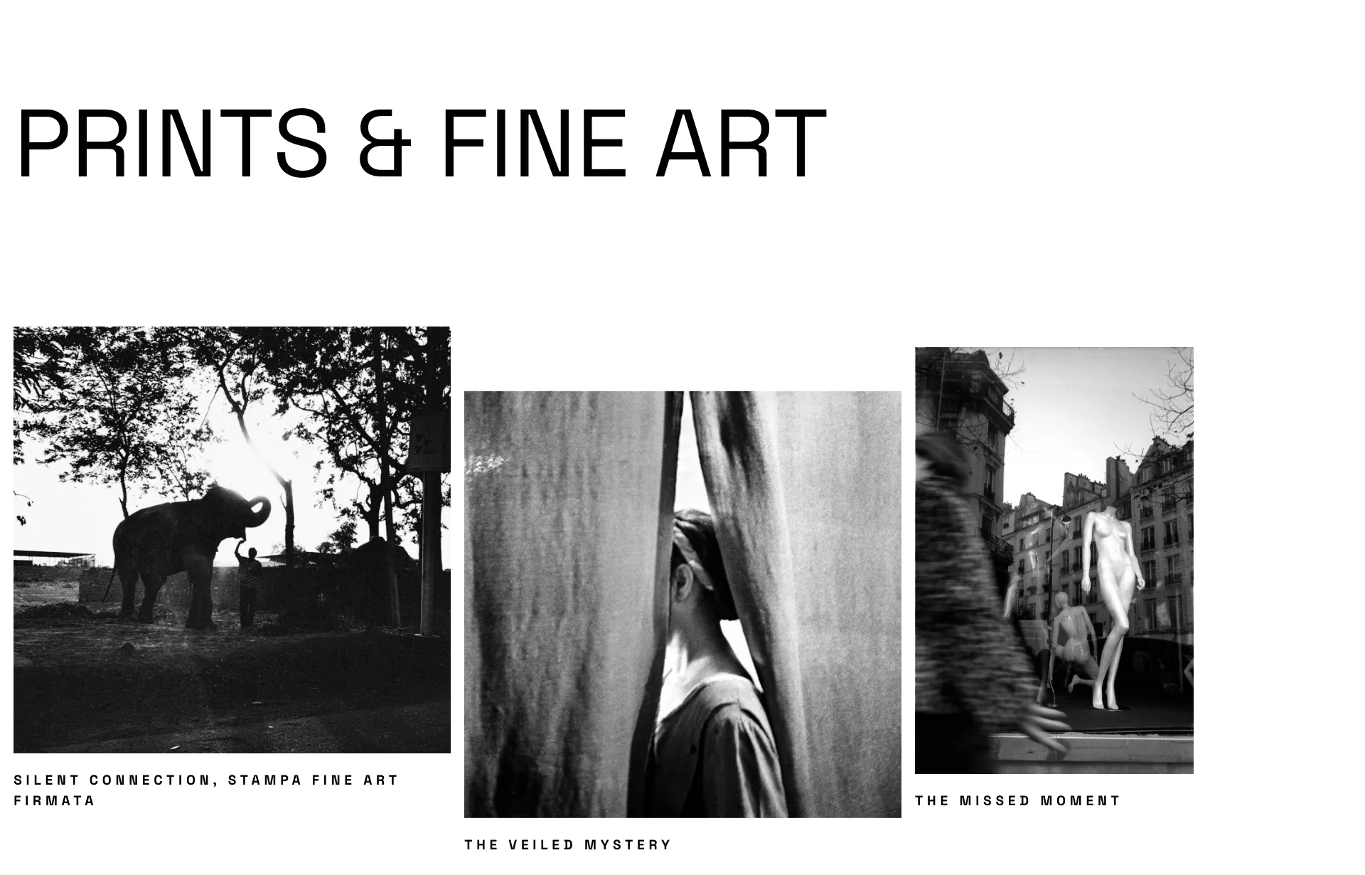
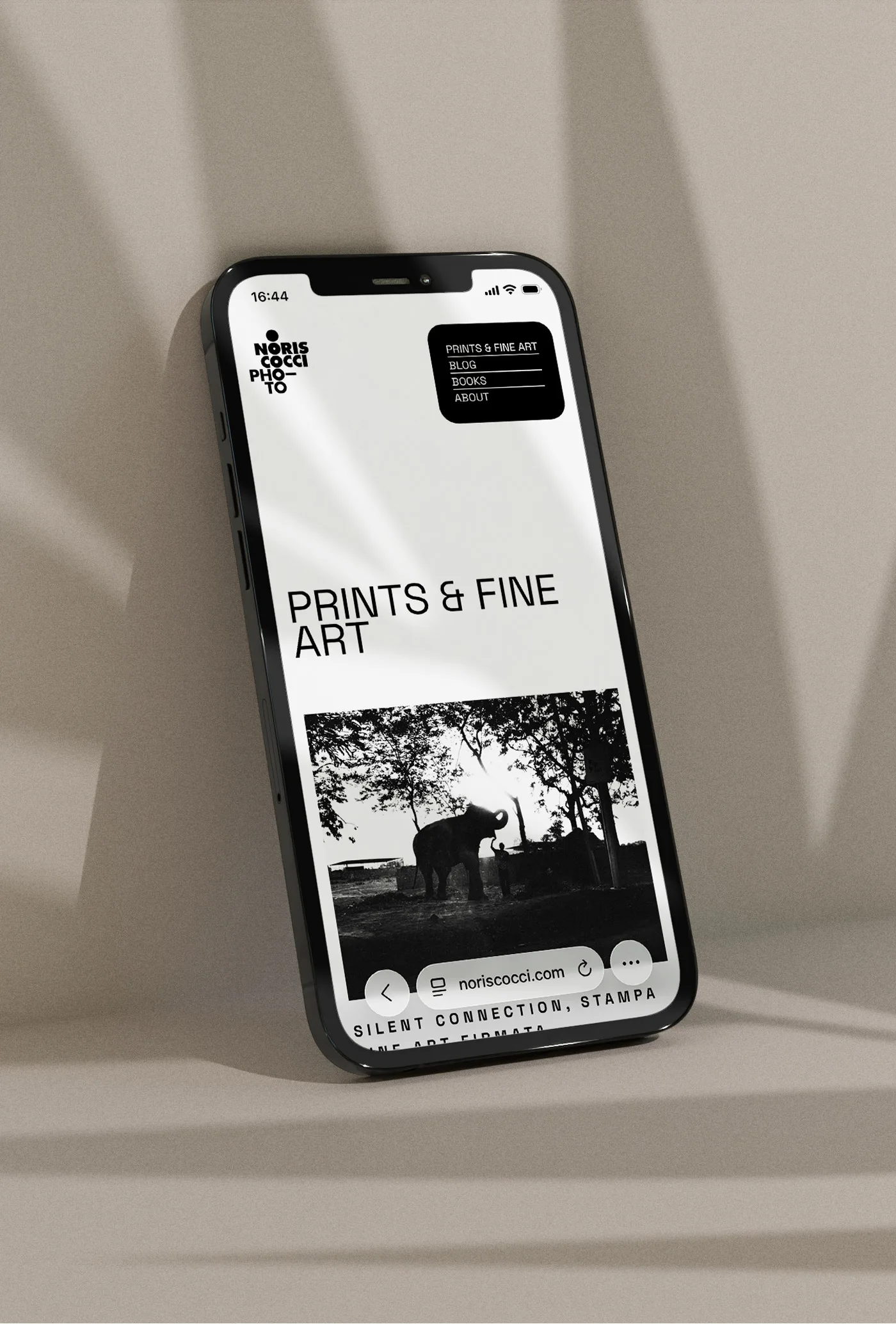
One typeface only, Space Grotesk, in three sizes: section titles at 112 pixels, running text at 16, captions at 16 in capitals with almost a third of an em of spacing. It is the only place where the design raises its voice, and it serves to hold together black-and-white photographs on a white page, without frames and without separating rules.
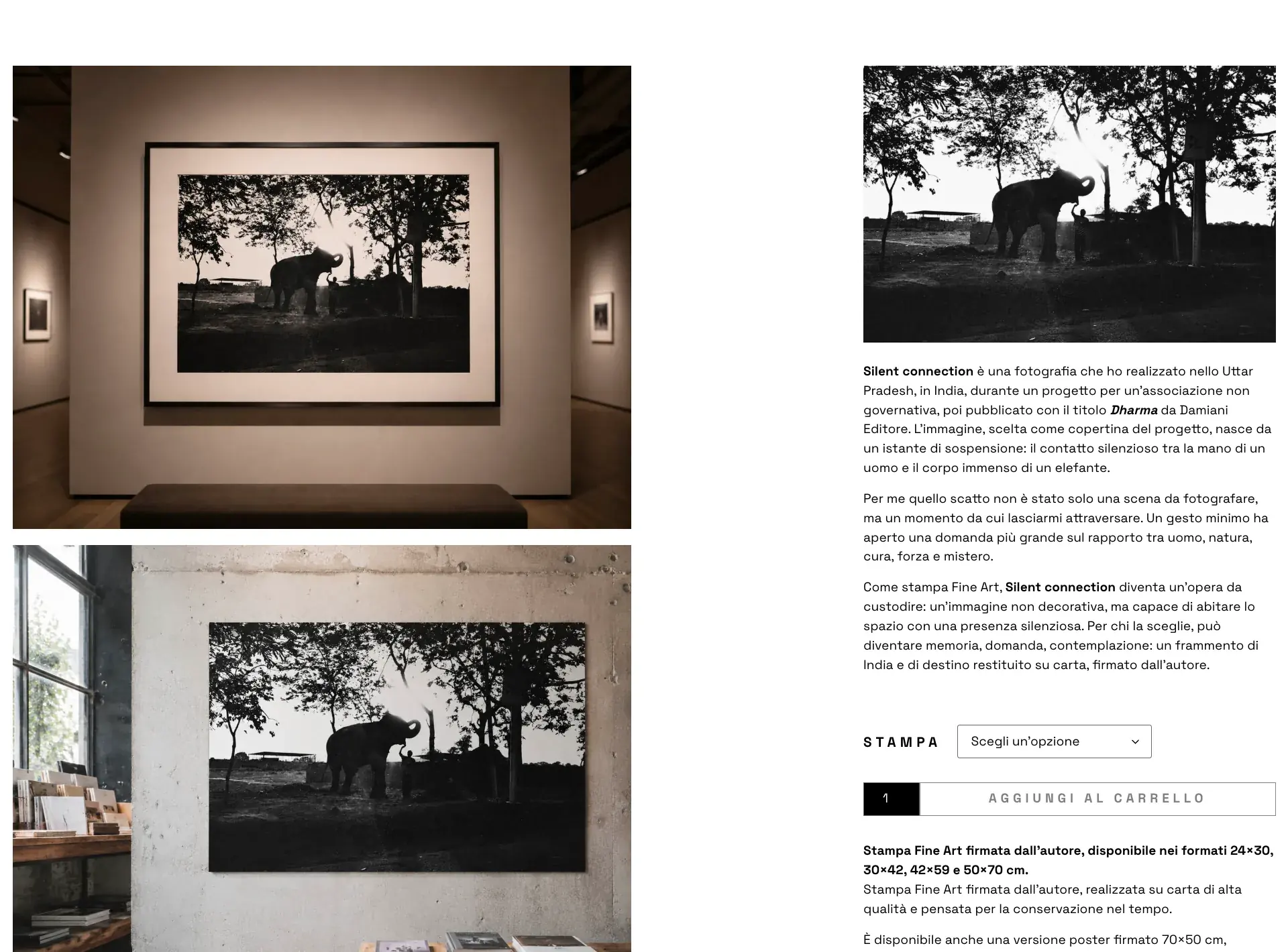
The shop sells signed prints. Each page holds together two things that are usually on different pages: the story of the shot, written by the author, and the e-commerce part — the size to choose among 24×30, 30×42, 42×59 and 50×70 centimetres, the quantity, the cart. The photographs on the page show the work hung on a wall, so the size reads as a measure in space and not as two numbers.
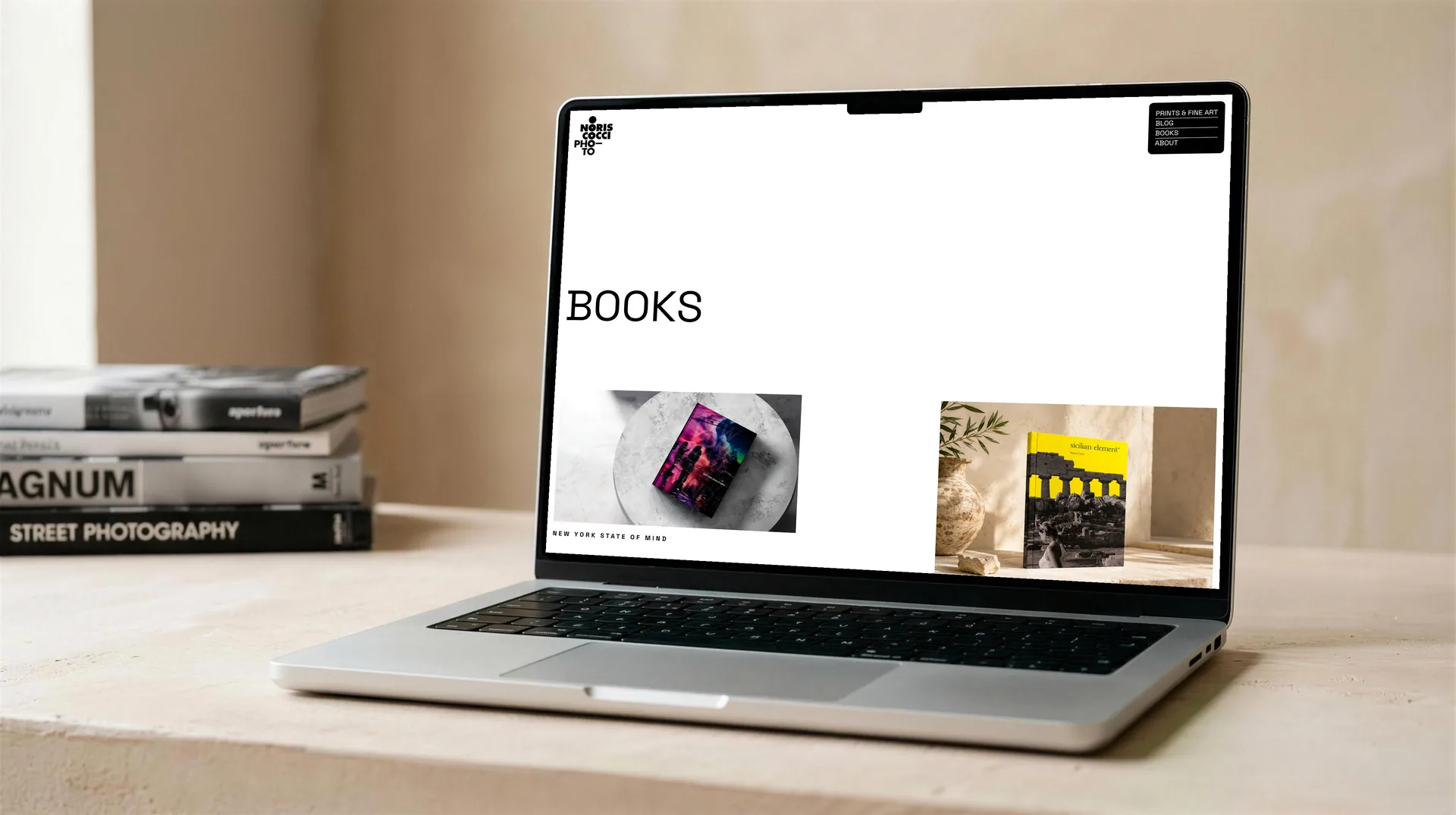
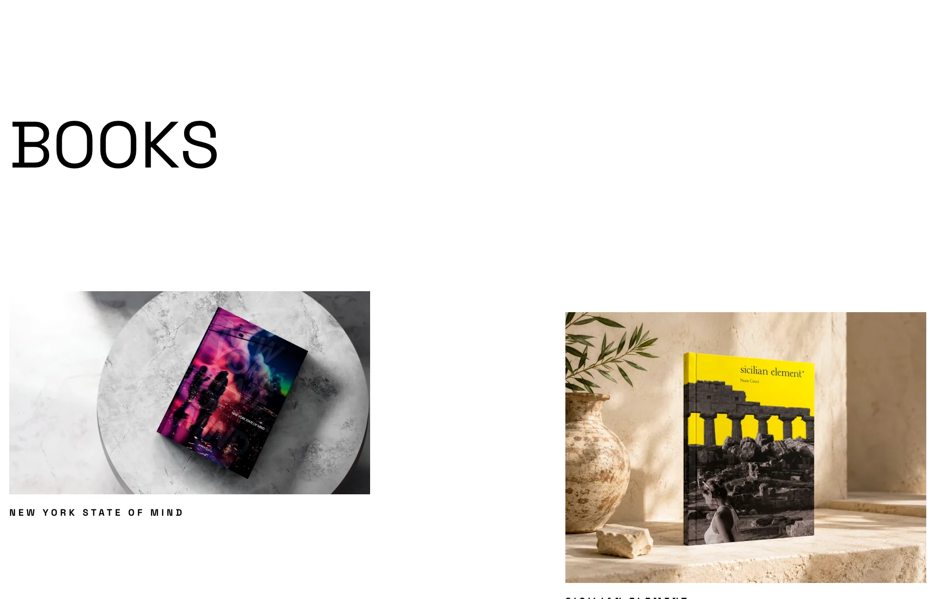
Books collects the author's books, one per page, with the cover, the data and the photographs inside. Three of those pages are books that I laid out myself — Sicilian Element, Snowsnap and Ventuno — and here they come back seen from the outside, as objects and not as pages to leaf through. Each page repeats the same four entries: author, title, collaboration, category.
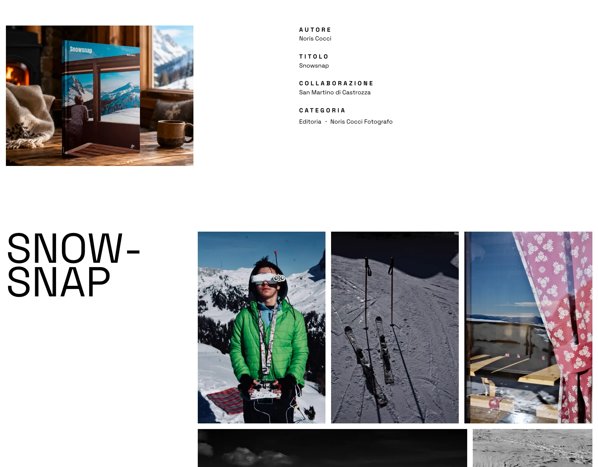
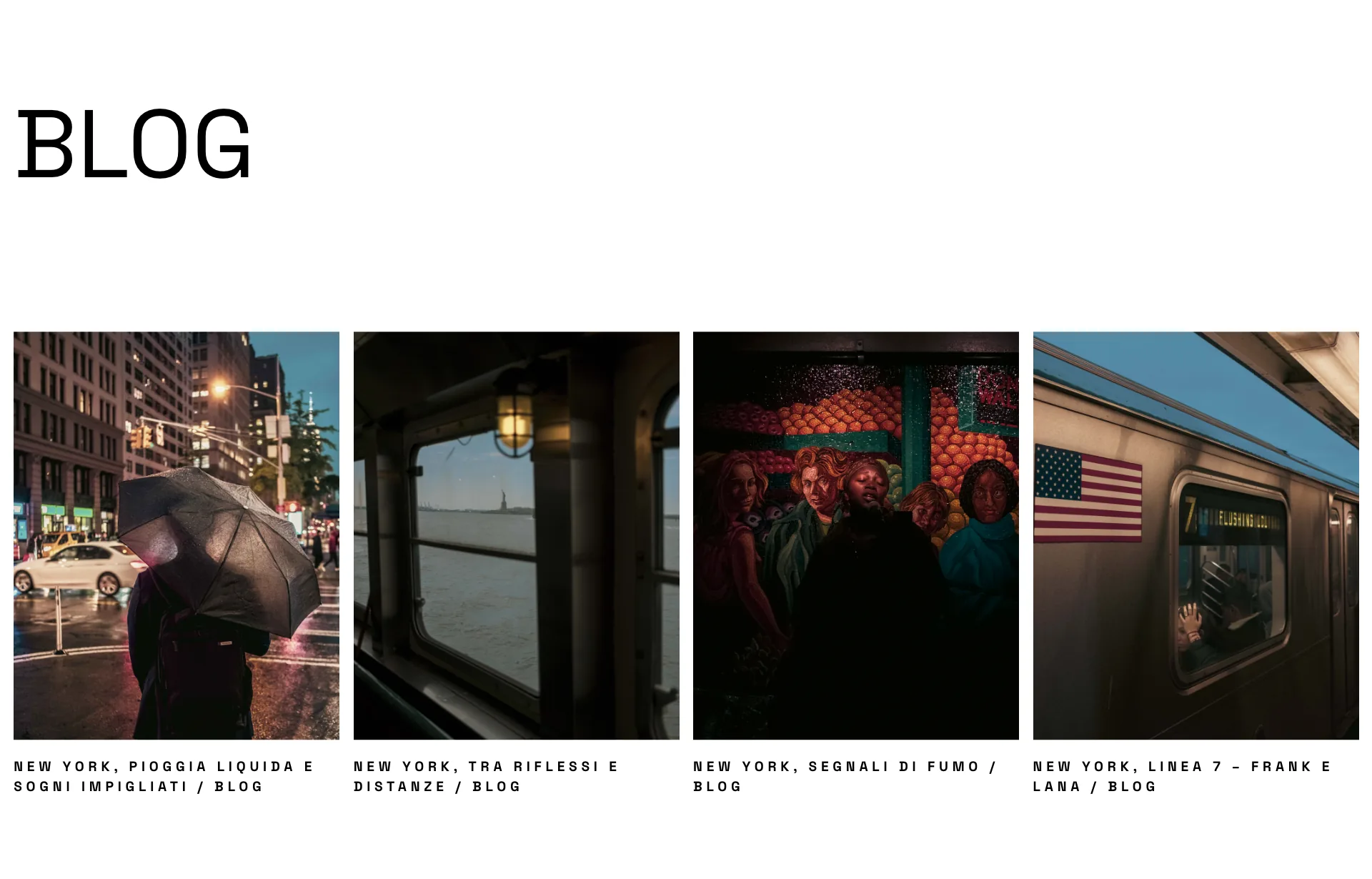
The blog is the only place on the site where colour comes in: they are travel stories, and the photographs stay as they were taken. It sits in the same layout as everything else, so the difference shows by itself.
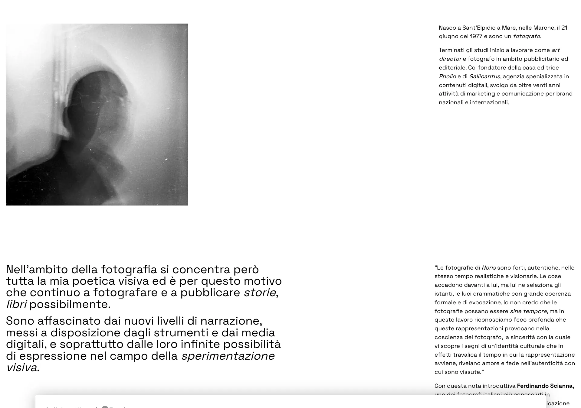
The About page sets the text in two columns of different size: on the left the author's sentences, as big as a headline, on the right the note by Ferdinando Scianna at reading size. They are two voices, and they are told apart by size before content.
More projects
013 — more projects- 001EntixBrand · Web · Product
- 002NutrinsectPackaging · Web · Print
- 003FrughìBrand · Packaging
- 004Processing Community DayBrand identity
- 005Natale in città 2023Brand · Campaign
- 006La Grande GuerraBrand identity
- 007Ancona RespiraBrand identity
- 008Io Sono Il ParcoBrand identity
- 009Tecla SystemBrand identity
- 010Moda ImmagineBrand identity
- 011Sicilian ElementPublishing
- 012SnowsnapPublishing
- 013VentunoPublishing