—
La Grande Guerra
Visual identity
Branding · Publishing · Print · Art direction
—
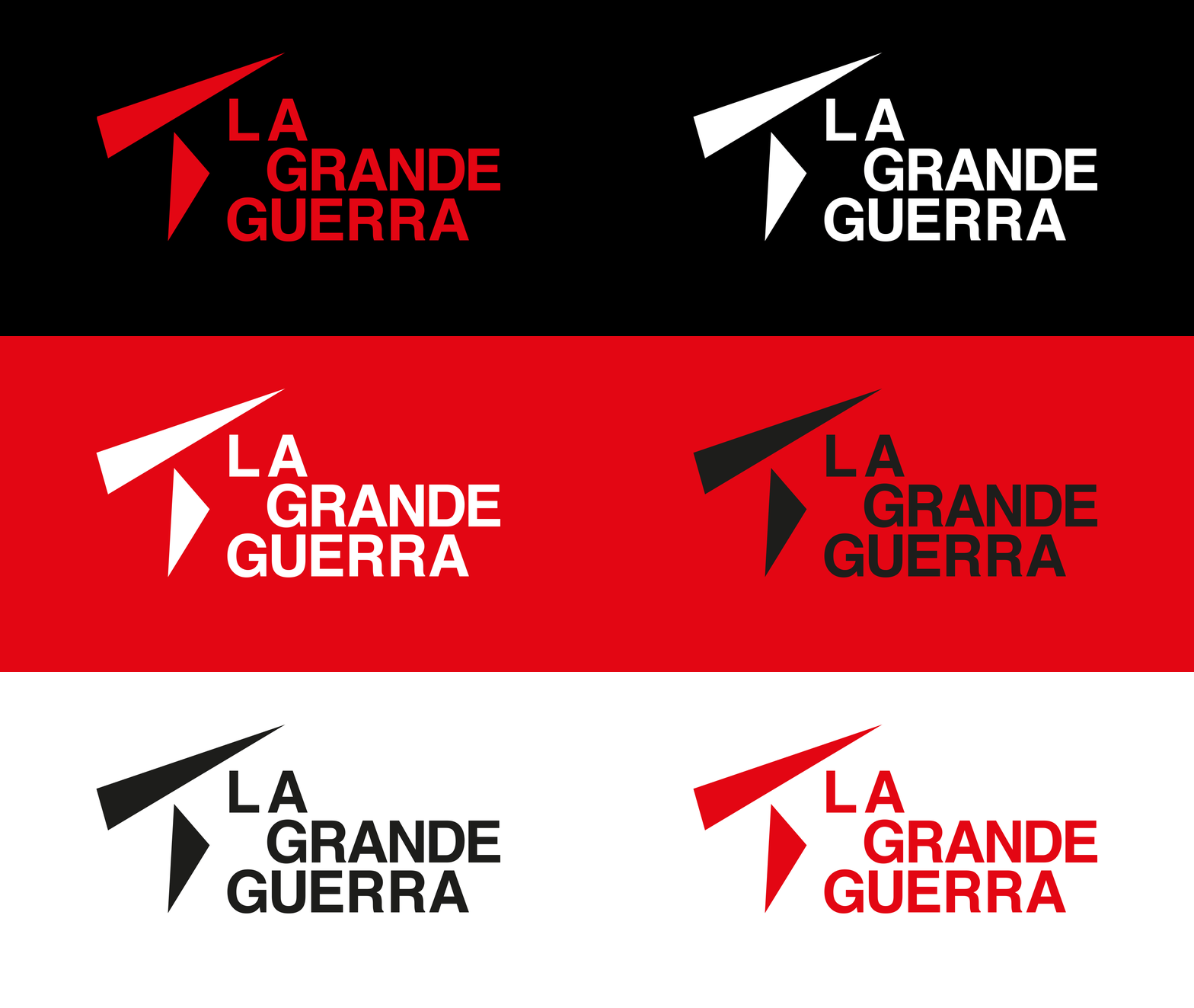
La Grande Guerra (“The Great War”) is a visual identity for a non-existent centenary: the festival never took place, and the project starts from there. The mark comes from joining the capitals of the two alliances that faced each other, and from those shapes comes everything else — posters, totems, booklet, leporello.
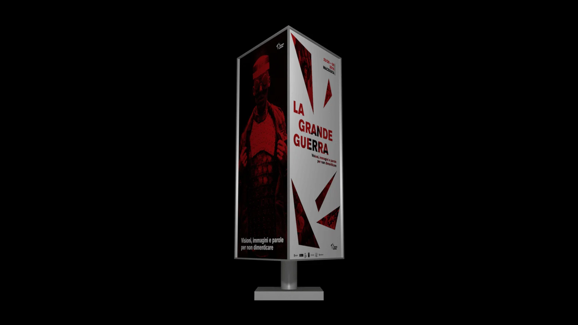
From capitals to mark
Shortly before the war Europe split in two: the Triple Alliance — Austria-Hungary, Germany, Italy — and the Triple Entente — Great Britain, France, Russia. Joining the capitals of those alliances produces two pointed figures, and those make the mark.
Red, black, halftone
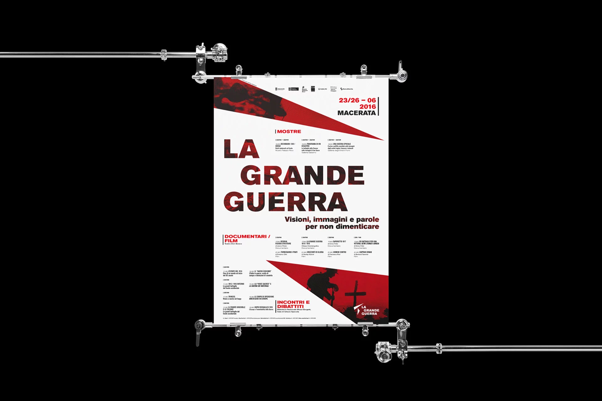
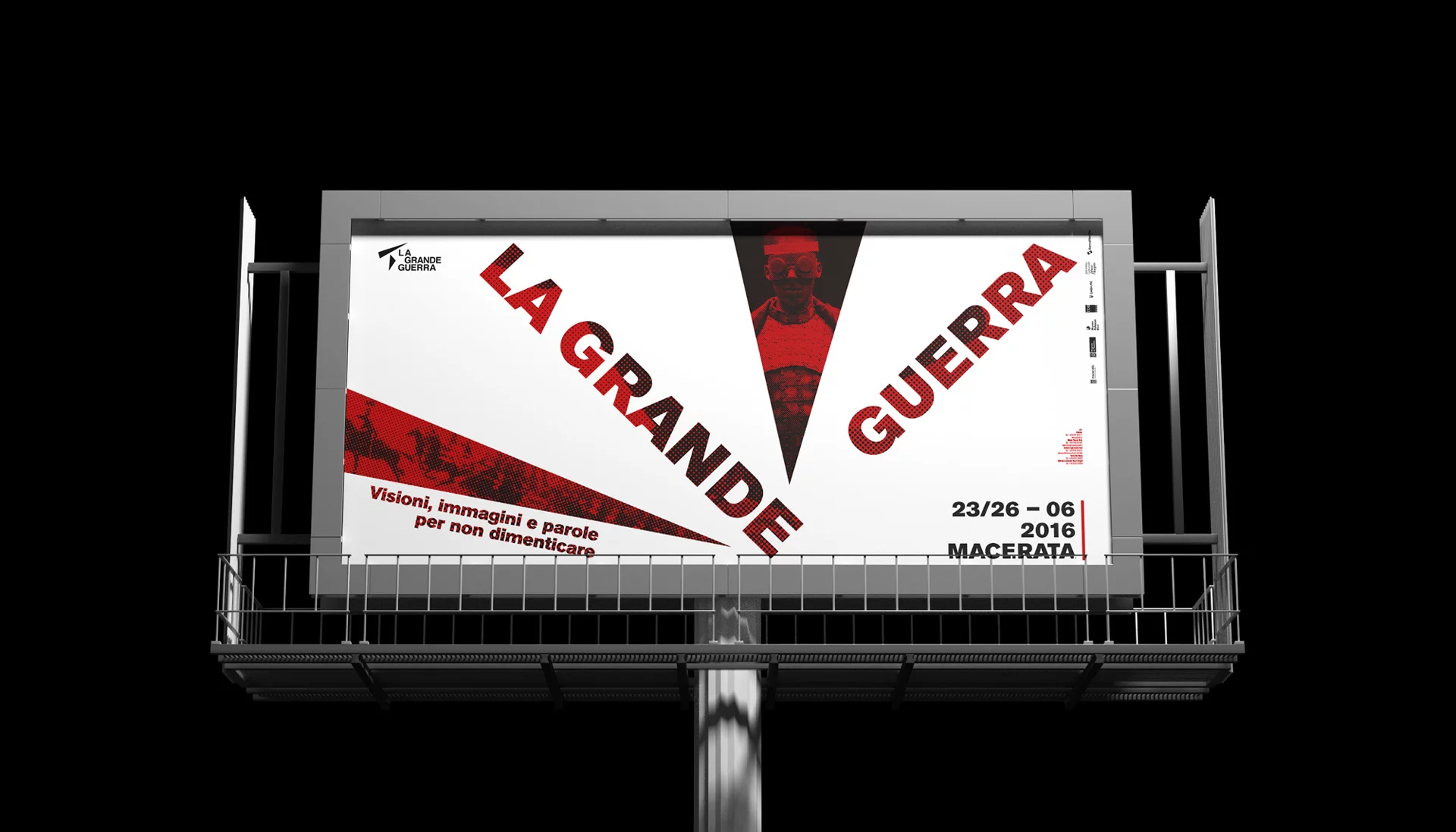
The system rests on three things: red, black and the halftone that grains the archive photographs. The same points cut every format on the diagonal, the poster as well as the cover of the booklet, and each time they reveal a piece of image.
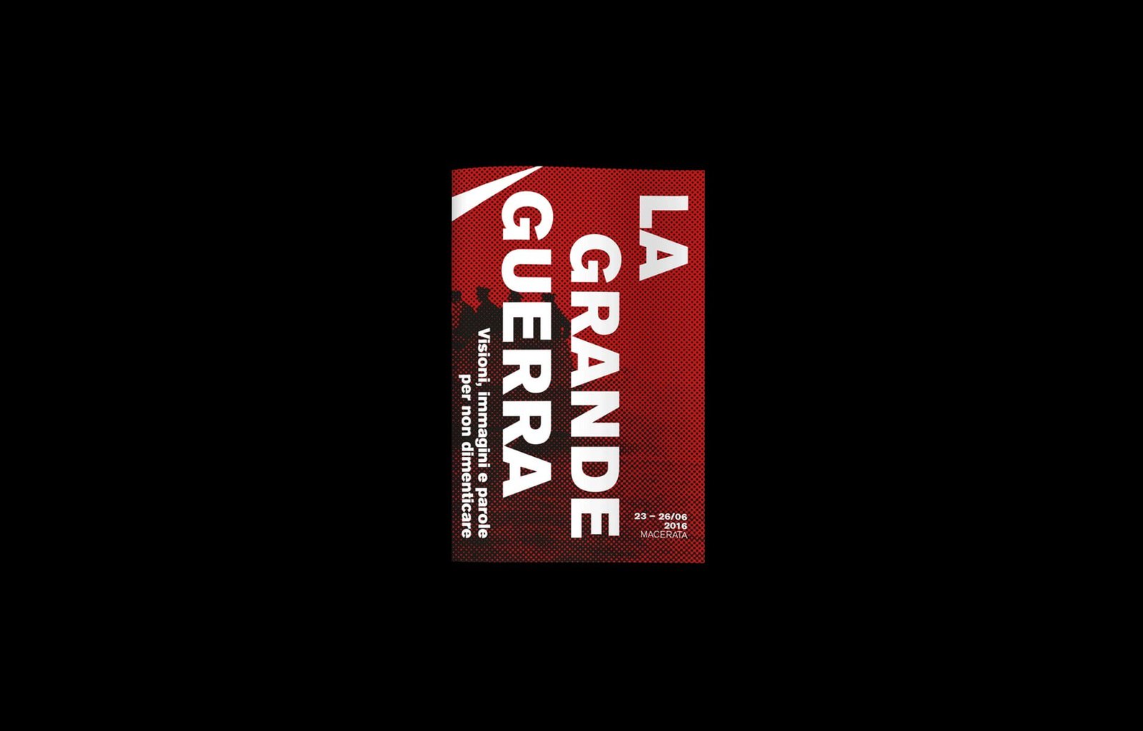
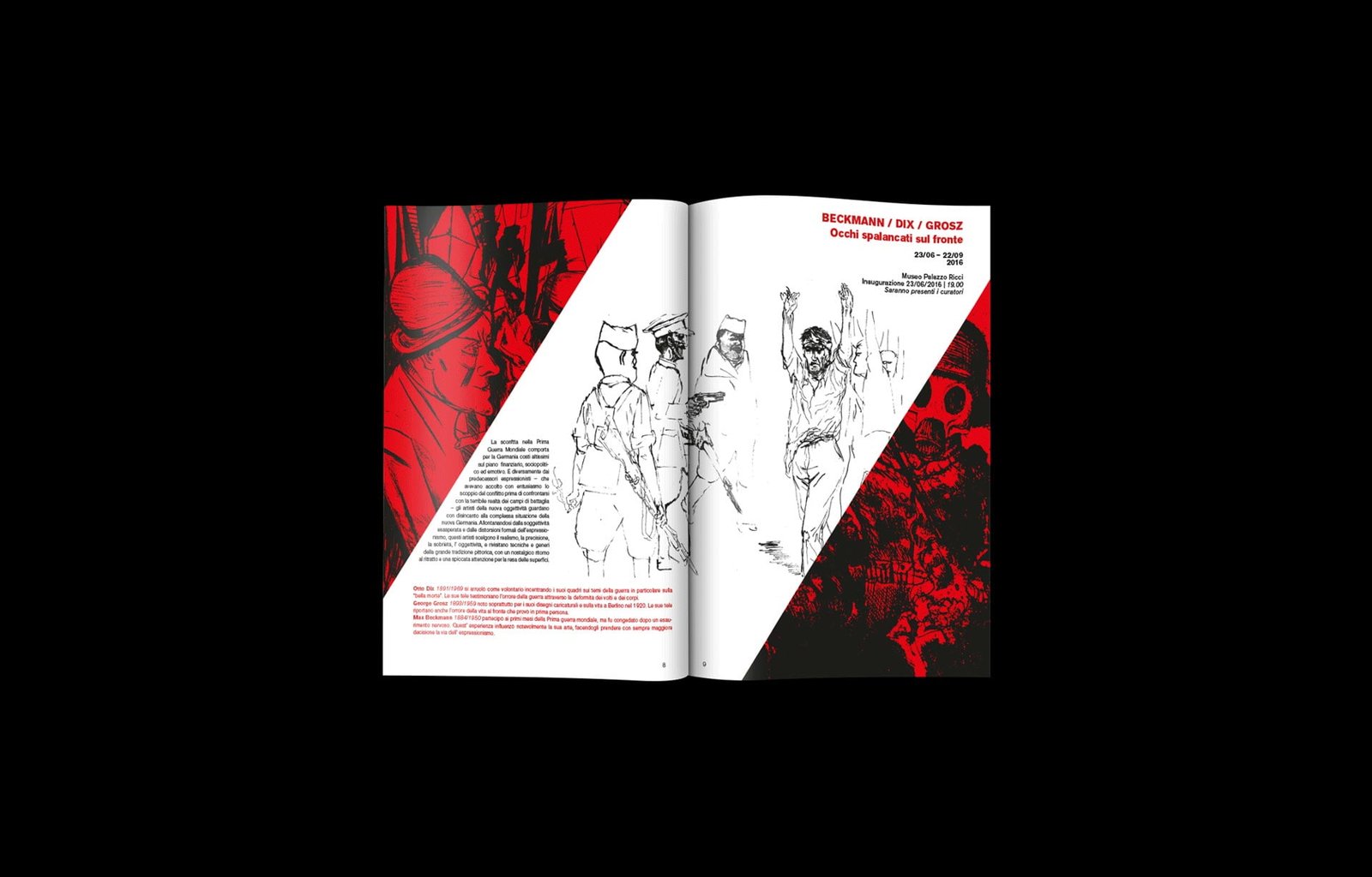
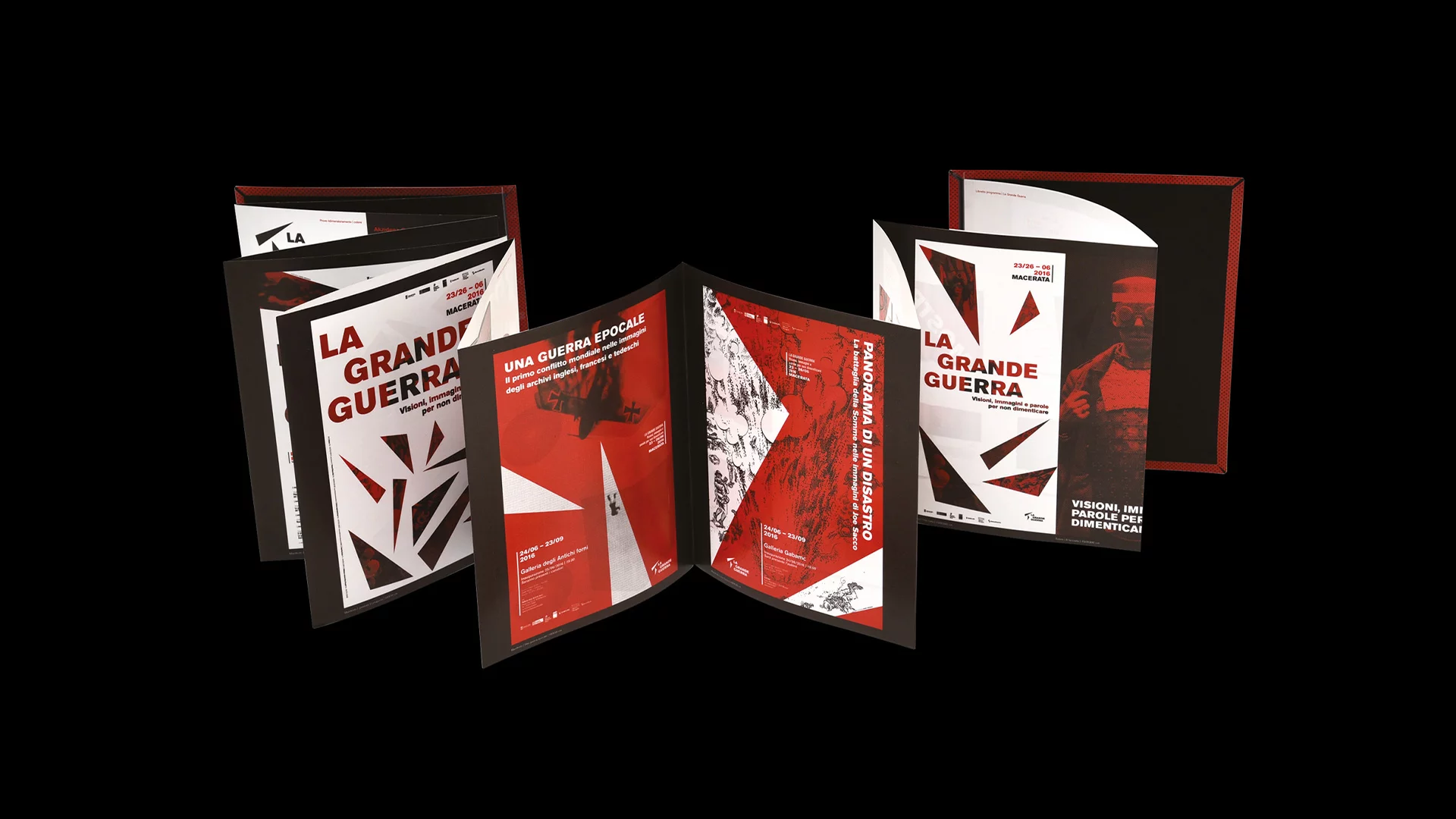
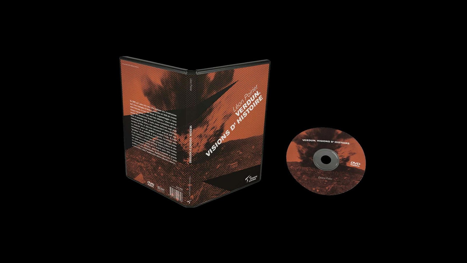
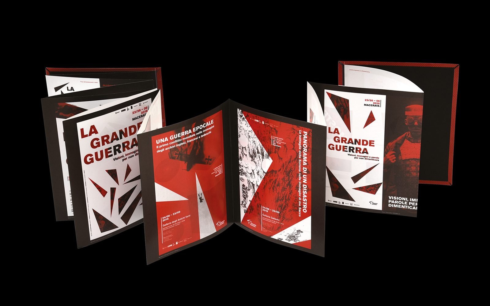
The system covers posters and billboards, the totems in the city, the programme booklet, the exhibition leporello and the DVD cases of the films on the programme.
More projects
013 — more projects- 001EntixBrand · Web · Product
- 002NutrinsectPackaging · Web · Print
- 003FrughìBrand · Packaging
- 004Processing Community DayBrand identity
- 005Natale in città 2023Brand · Campaign
- 007Ancona RespiraBrand identity
- 008Io Sono Il ParcoBrand identity
- 009Tecla SystemBrand identity
- 010Moda ImmagineBrand identity
- 011Sicilian ElementPublishing
- 012SnowsnapPublishing
- 013VentunoPublishing
- 014Noris CocciWeb design