—
Nutrinsect
Packaging and website
Labels · Print · E-commerce
—
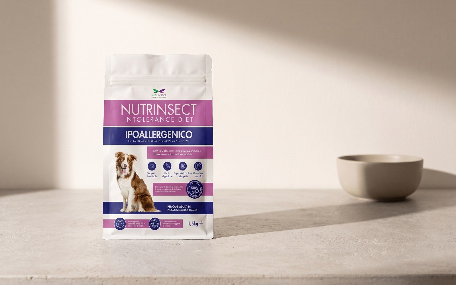
Nutrinsect breeds Acheta domesticus crickets in Montecassiano, in the Marche region, and sells them as pet food: for dogs, freshwater turtles, tropical fish, reptiles, rodents and insectivorous birds. I worked on the packaging for four product families, the brochure for the dog food and the website with the shop. The pieces arrived at different times, and each had to hold up next to those already on the shelf.
One grid, four families
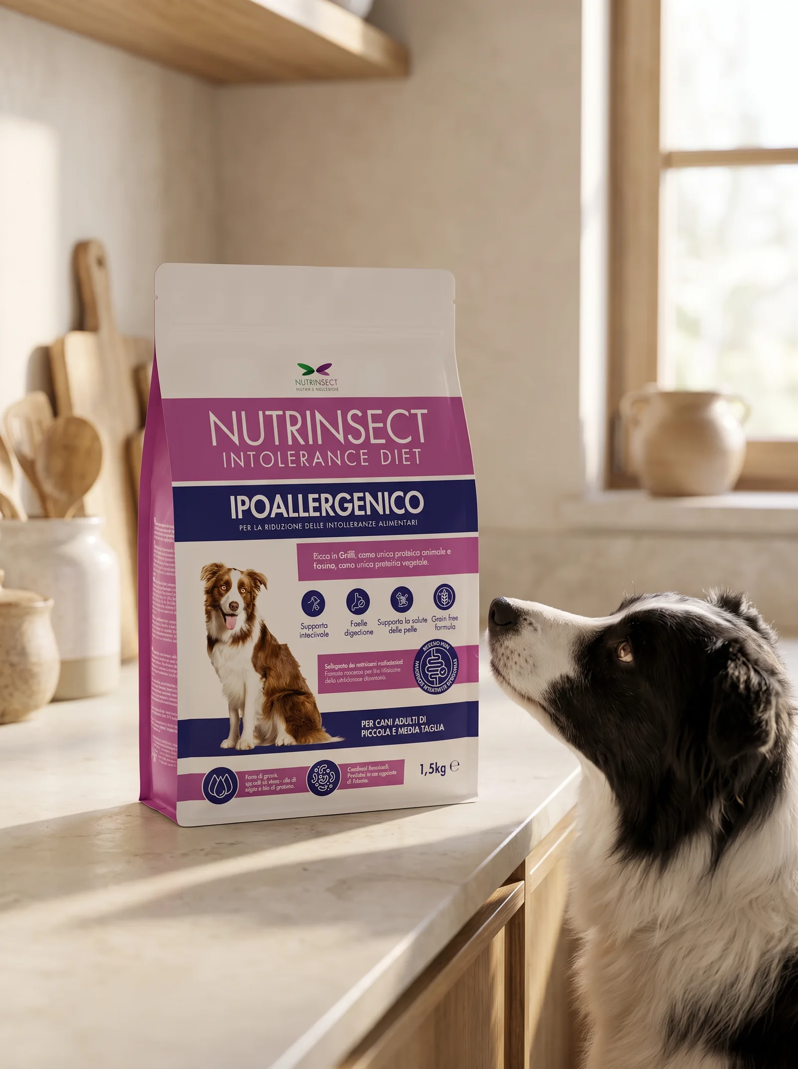
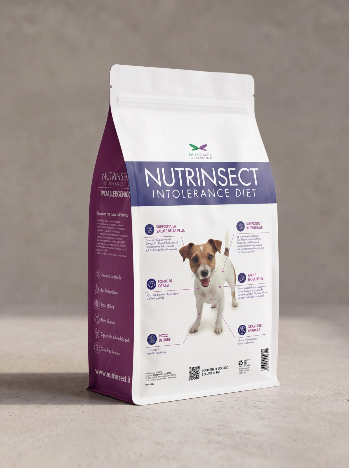
Every package assembles the same parts in the same order: the brand at the top centre, the product name in a narrow all-caps grotesque, the italic subtitle, the line of origin underlined in the Italian tricolour, and at the bottom the pills of selling points with the weight beside them. Format and colour change, not the scheme: whoever picks up a 50 g jar or a 500 ml pouch finds the same information in the same place.
Colour tells the animal
Green is for turtles, purple for tropical fish, white for the freeze-dried crickets to rehydrate, magenta with blue for the dog food. They all come from the brand, which has one green wing and one purple. On a pet-shop shelf the range is recognisable from afar, before you even get to reading the product name.
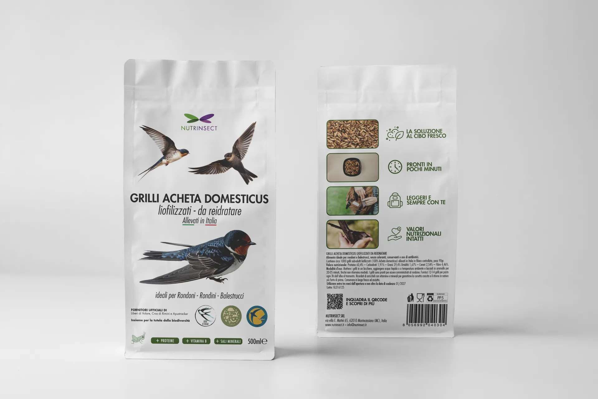
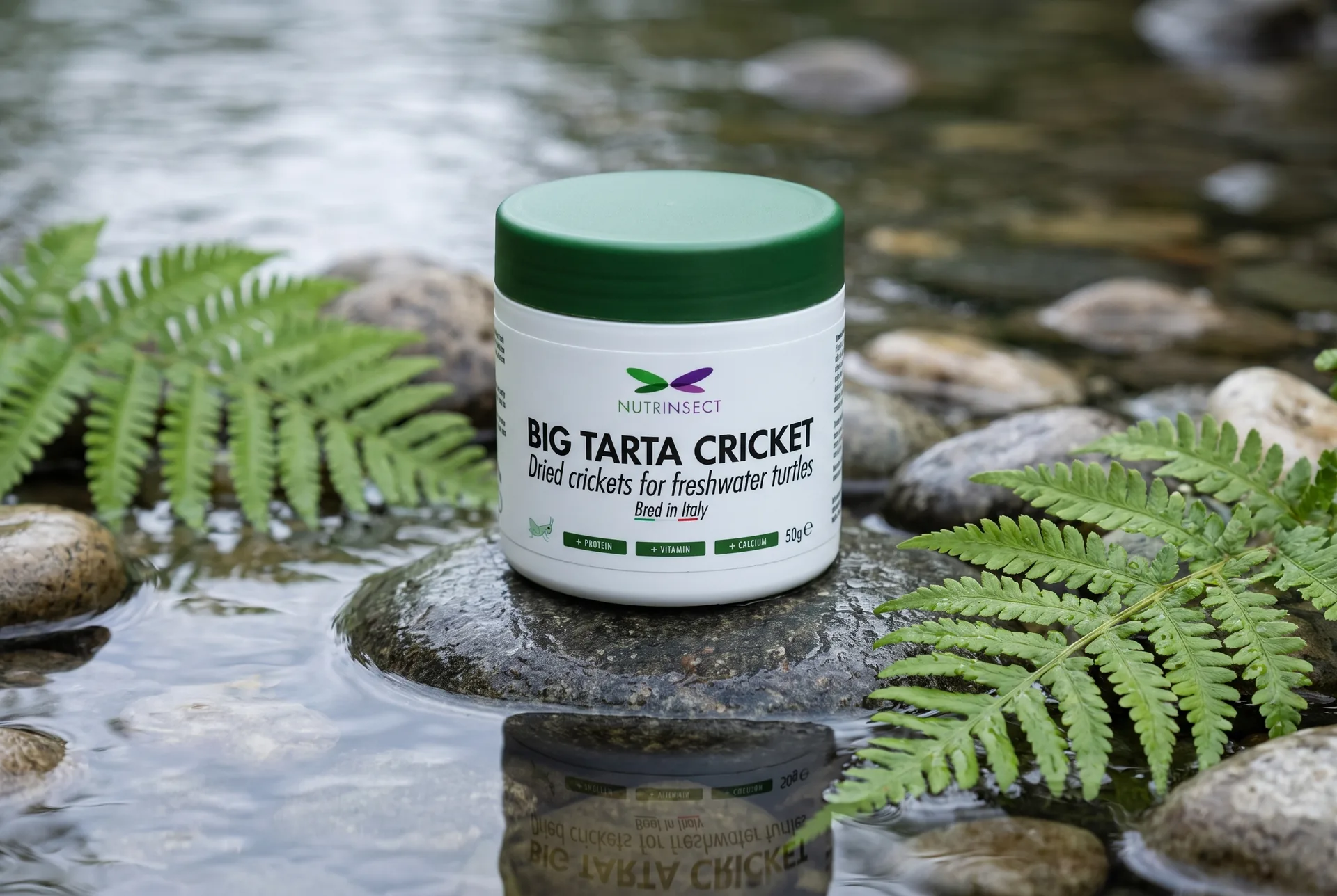
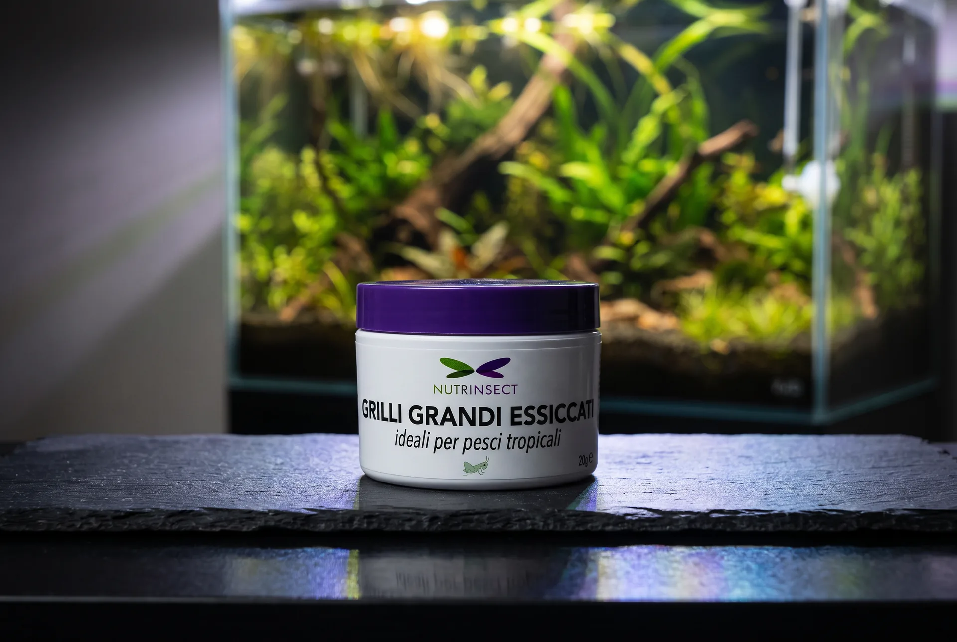
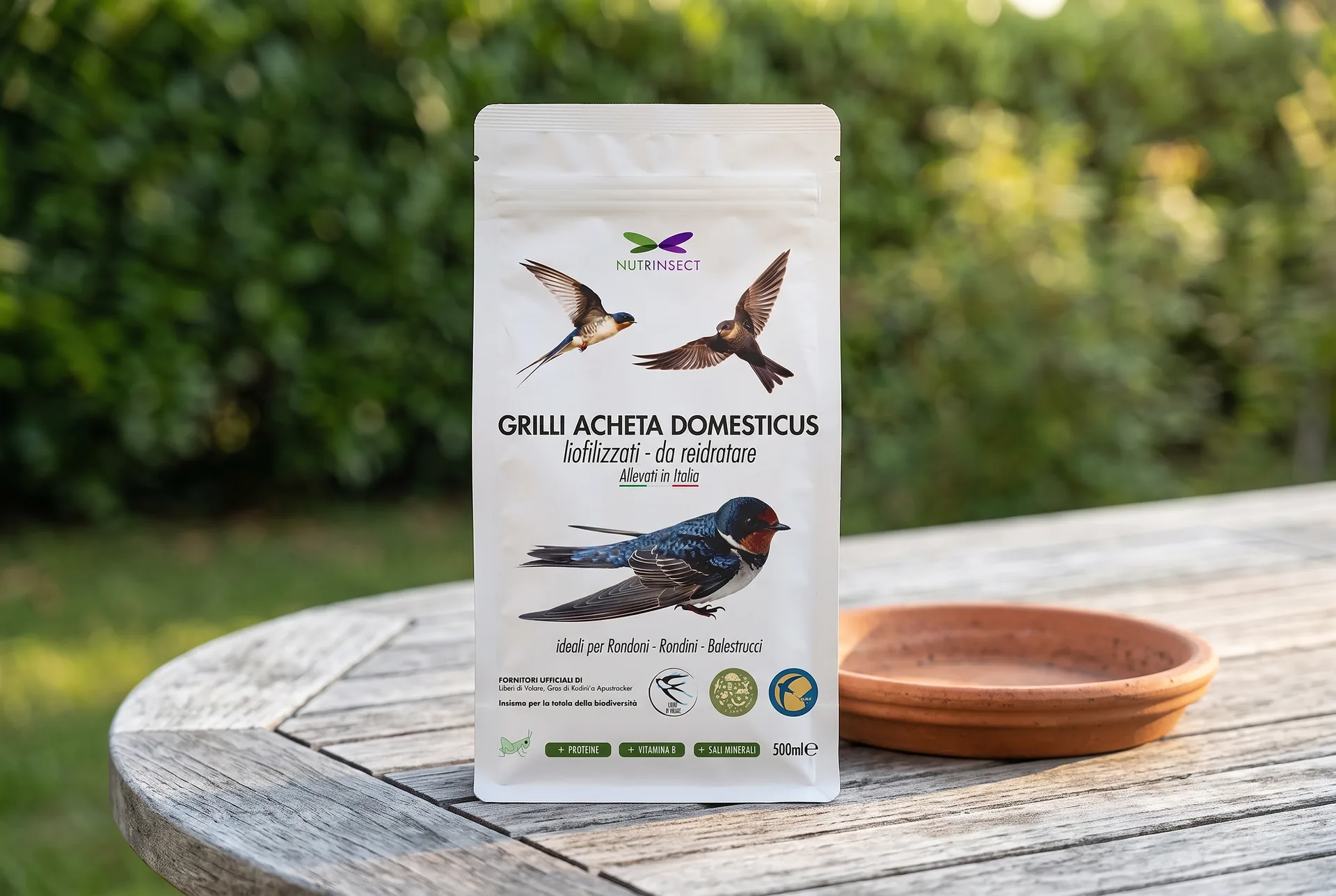
The jars come in three sizes for the turtles and three for the fish, with the same front and only the size word changing: Baby, Medium and Big for the former, micro, medi and grandi (small, medium, large) for the latter. The bird pouch is the only one that carries, at the bottom, the logos of those who use it in the field, the wildlife rescue centres, above the line on biodiversity protection.
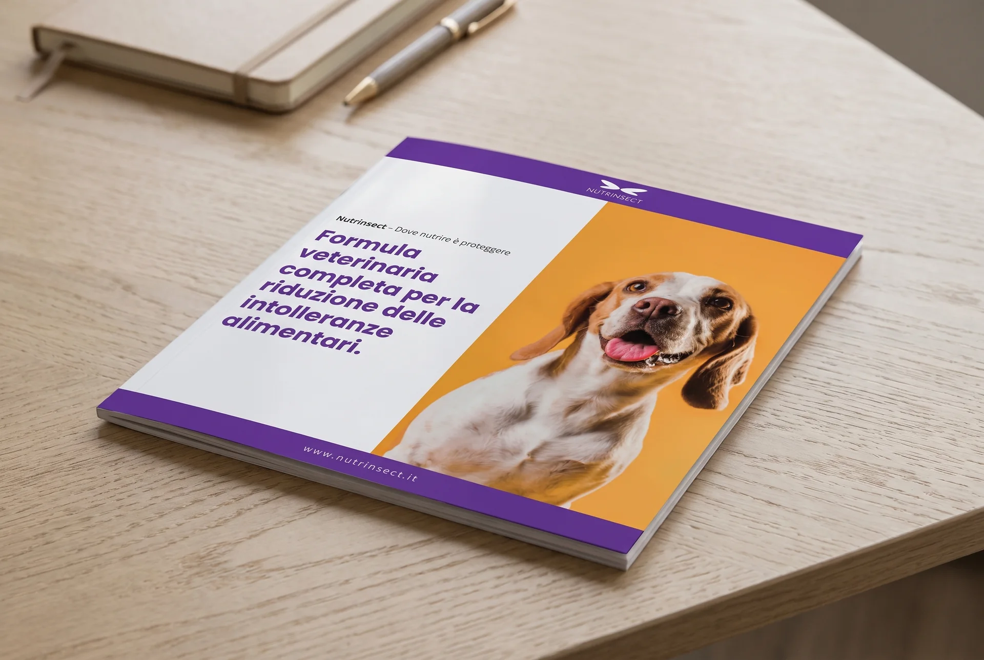
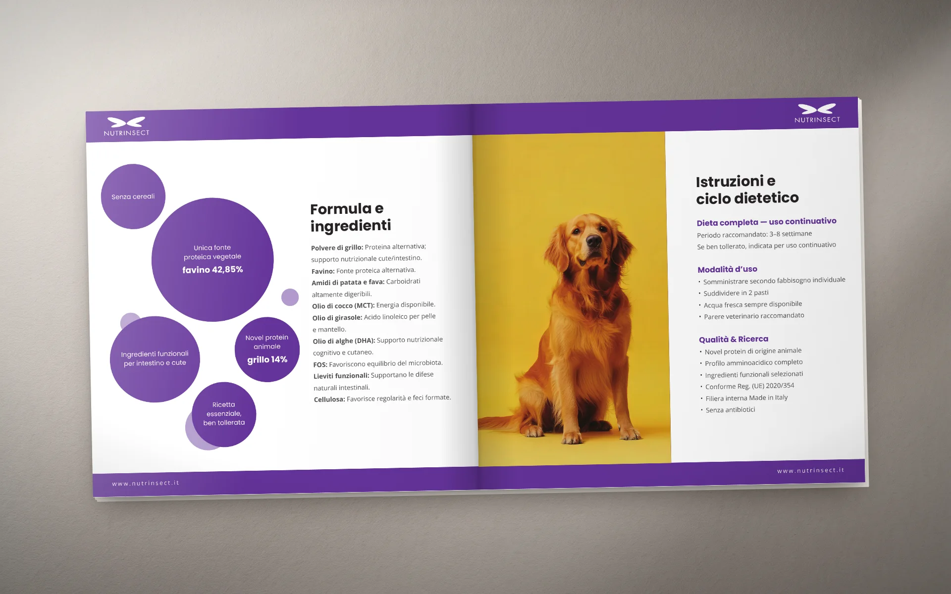
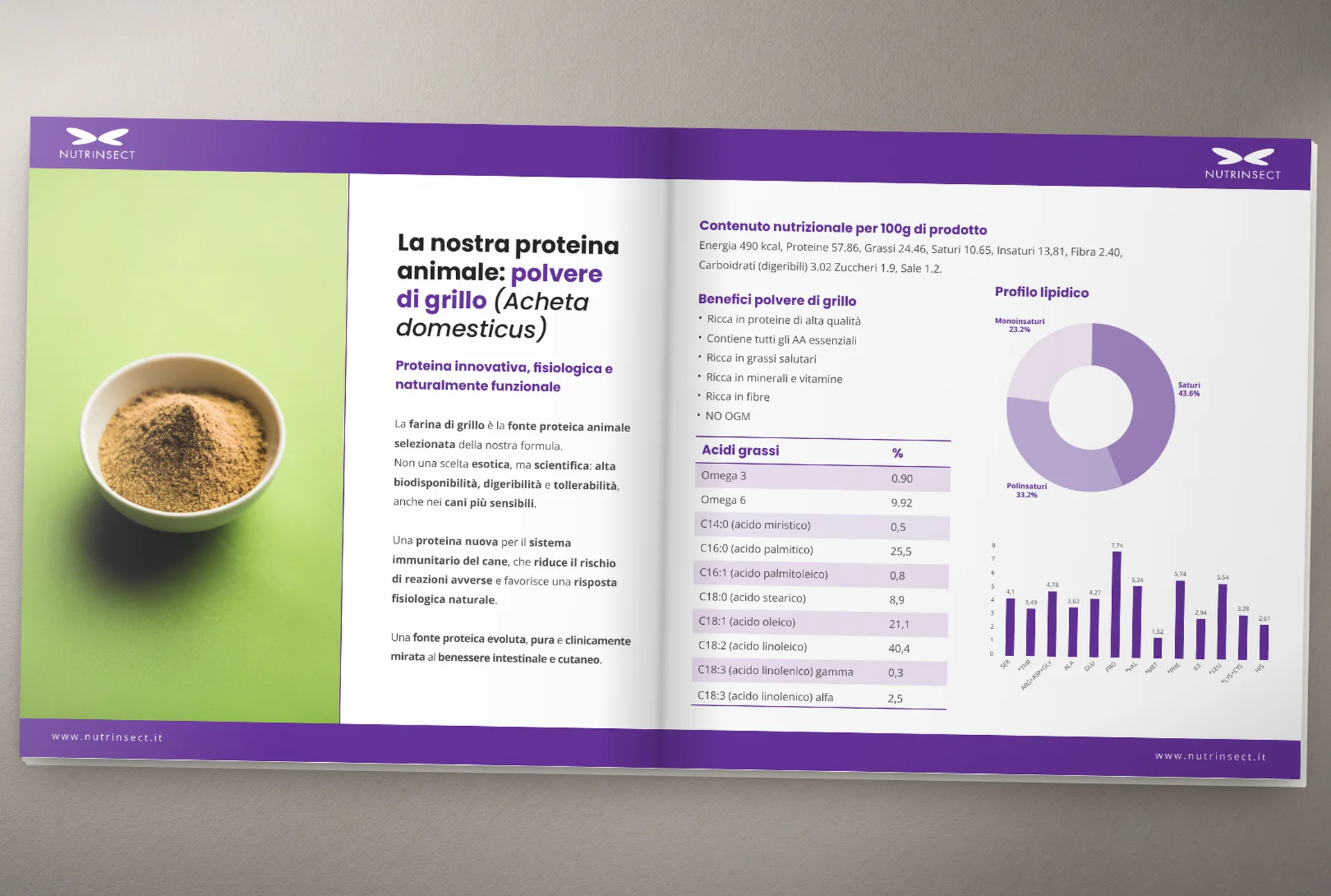
The brochure is a 21×21 cm, seven-page piece for the hypoallergenic feed, designed for the vet's and the shop's counter. Inside are things a promotional leaflet usually doesn't carry: the clinical context, the indications, the full composition, the dosage table by weight and the lipid profile of cricket flour. The look is all purple, with circles as the only recurring graphic element, and the animal photographs sit on saturated solid grounds that set them apart from the white of the cage.
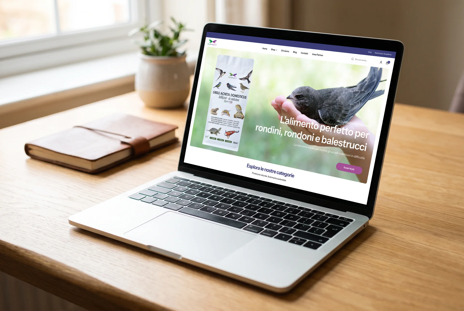
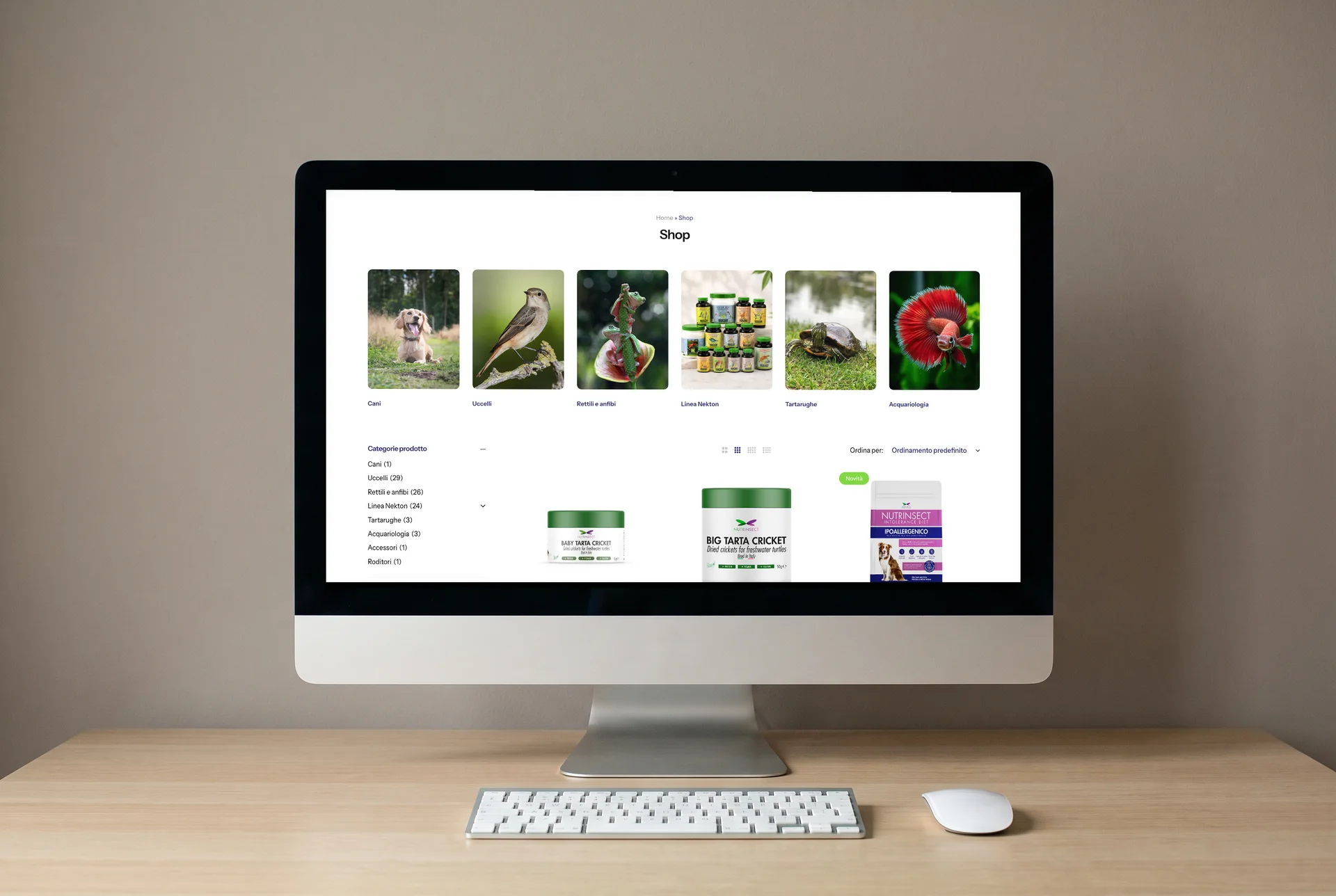
The site is a WooCommerce shop, and I redid both the pages and the store. The home opens with a carousel of slides, one per animal family, and continues with the categories, the best sellers, three tiles leading to the department pages, and the reviews. Below are a blog, an Academy section, a partner area and the English version. The cart accepts PayPal, Amazon Pay, Google Pay and instalment payment.
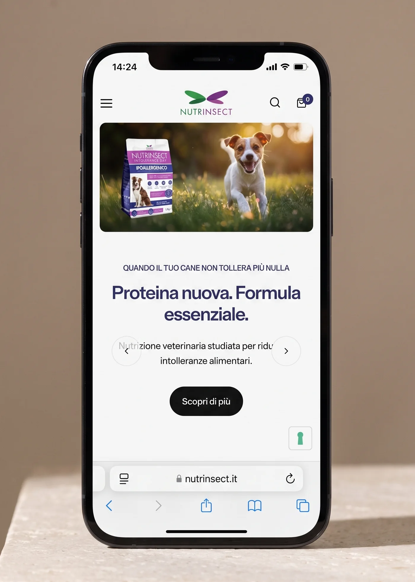
On the product page two lines say things that count in pet food as much as the graphics: within how many days the order arrives, and that shipments leave only Monday to Wednesday because there are live insects inside. I kept them above the fold, next to the button, rather than at the bottom with the terms of sale.
More projects
013 — more projects- 001EntixBrand · Web · Product
- 003FrughìBrand · Packaging
- 004Processing Community DayBrand identity
- 005Natale in città 2023Brand · Campaign
- 006La Grande GuerraBrand identity
- 007Ancona RespiraBrand identity
- 008Io Sono Il ParcoBrand identity
- 009Tecla SystemBrand identity
- 010Moda ImmagineBrand identity
- 011Sicilian ElementPublishing
- 012SnowsnapPublishing
- 013VentunoPublishing
- 014Noris CocciWeb design