—
Frughì
Visual identity
Brand mark · Labels · Packaging · Stationery · Merchandising
—
Frughì is a fruit and clarified butter cream: extra jam and butter in the same jar, lactose-free. It was born in Polverigi, in the Marche region, from an idea by Rodolfo Aji; the company opened in 2017 and the two partners put it into inactive status in 2019. Relaunching the brand was the case study of my final thesis for the Unicam master's for innovation process managers in cultural and creative start-ups, discussed in four. I handled the visual identity: mark, logotype, colours, texture, labels, packaging, correspondence stationery and merchandising.
An F that spreads
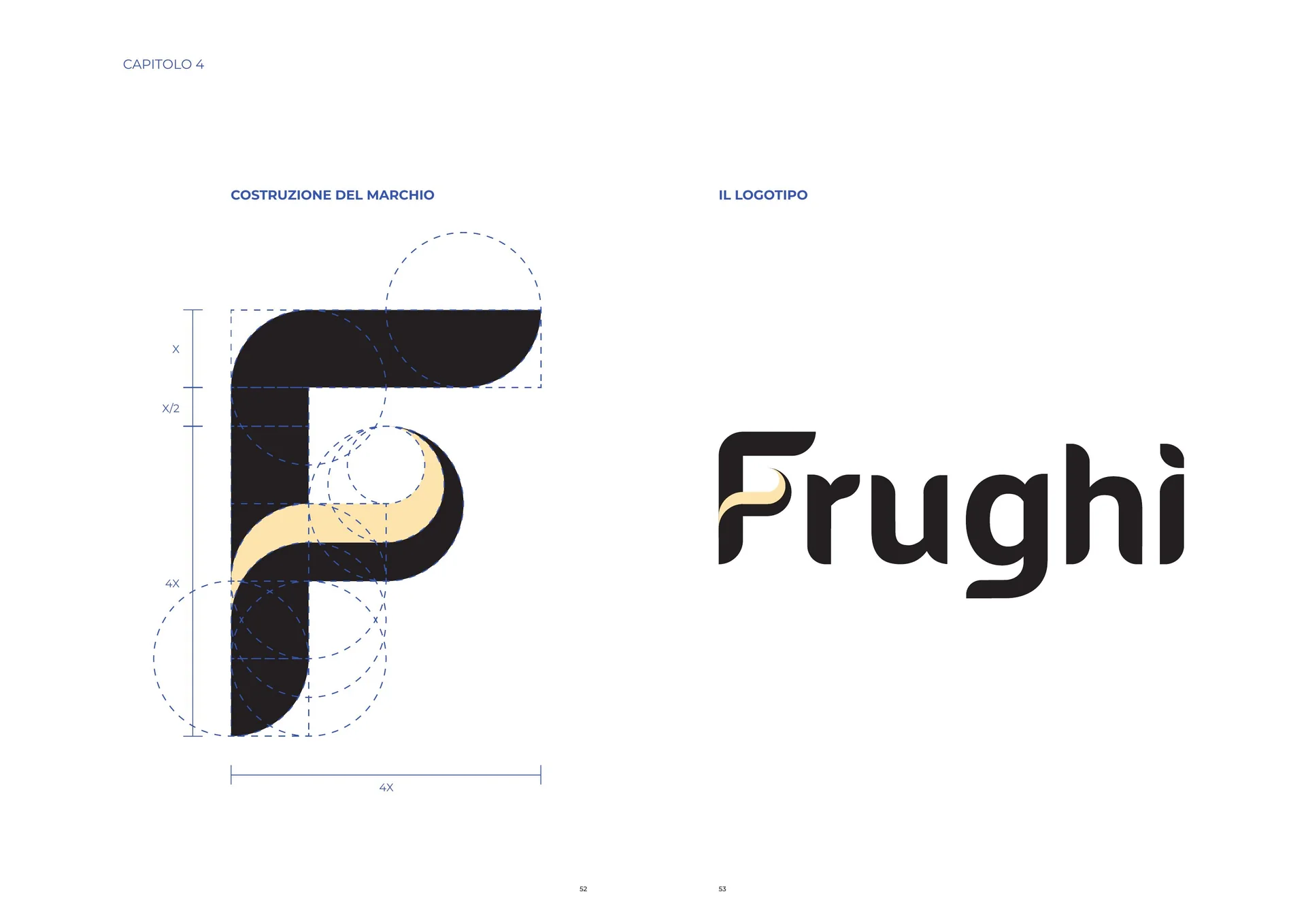
The mark is the initial F of the name, with its tie — the short middle arm — redrawn as an S-curve that widens and thins, like butter spread on bread. The rest of the letter keeps round corners and a solid stroke, so the curve reads as the only thing that happens. The drawing sits on a grid of four modules per side, and every joint comes from a circle.
One logotype, four flavours
The logotype comes from Godong Regular, retouched: the F carries the mark's tie, in butter yellow, and the accent of the ì is cut on the slant like the terminals of the other letters. Below, the payoff in spaced capitals: fruit cream, chosen among thirteen trials that alternated mousse, cream, spread and fior di.
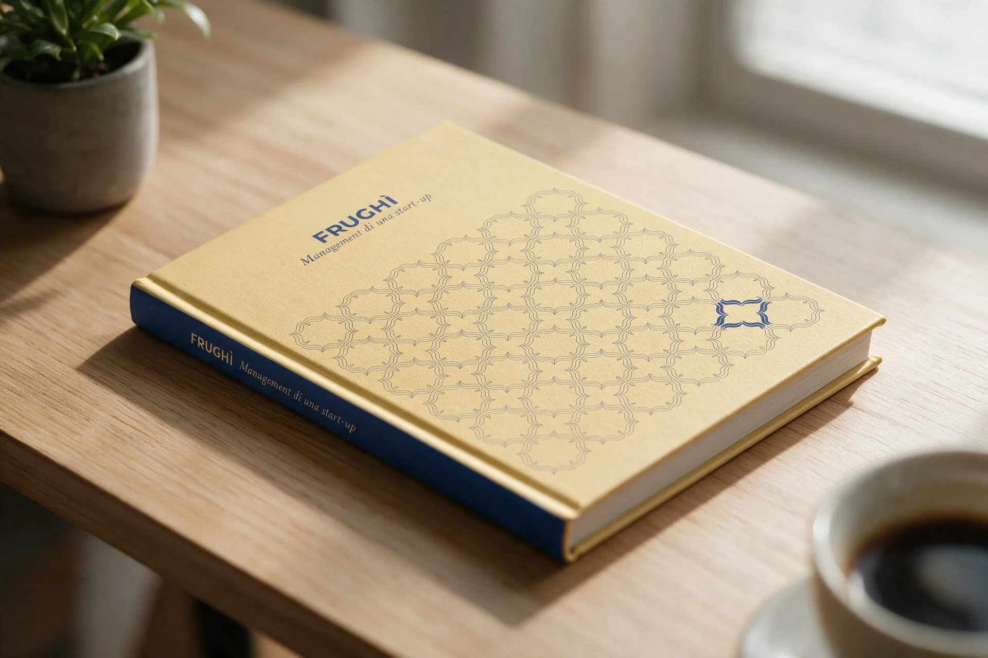
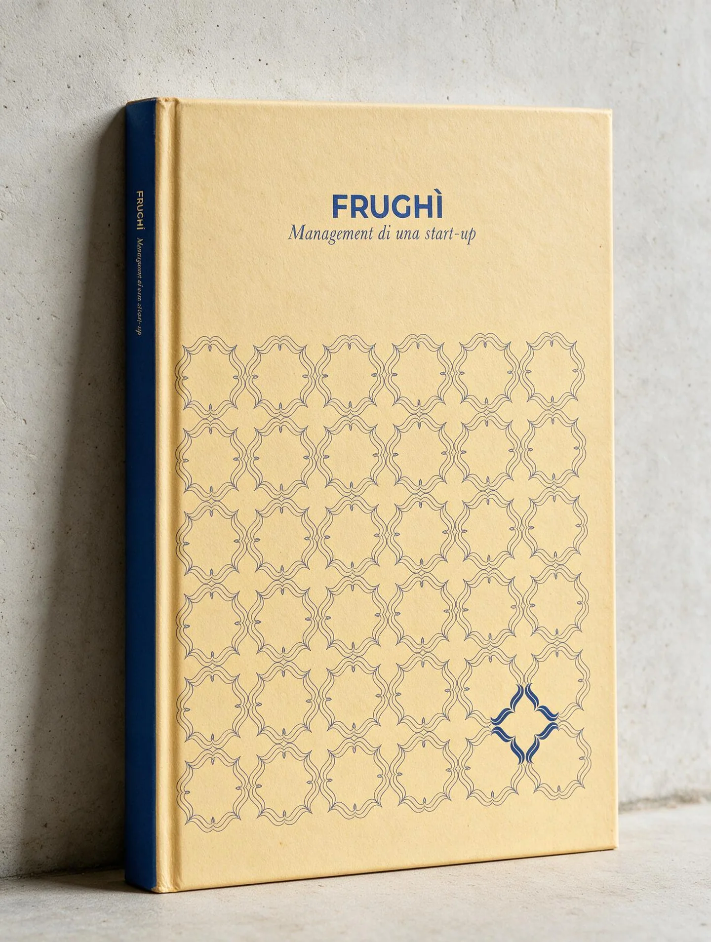
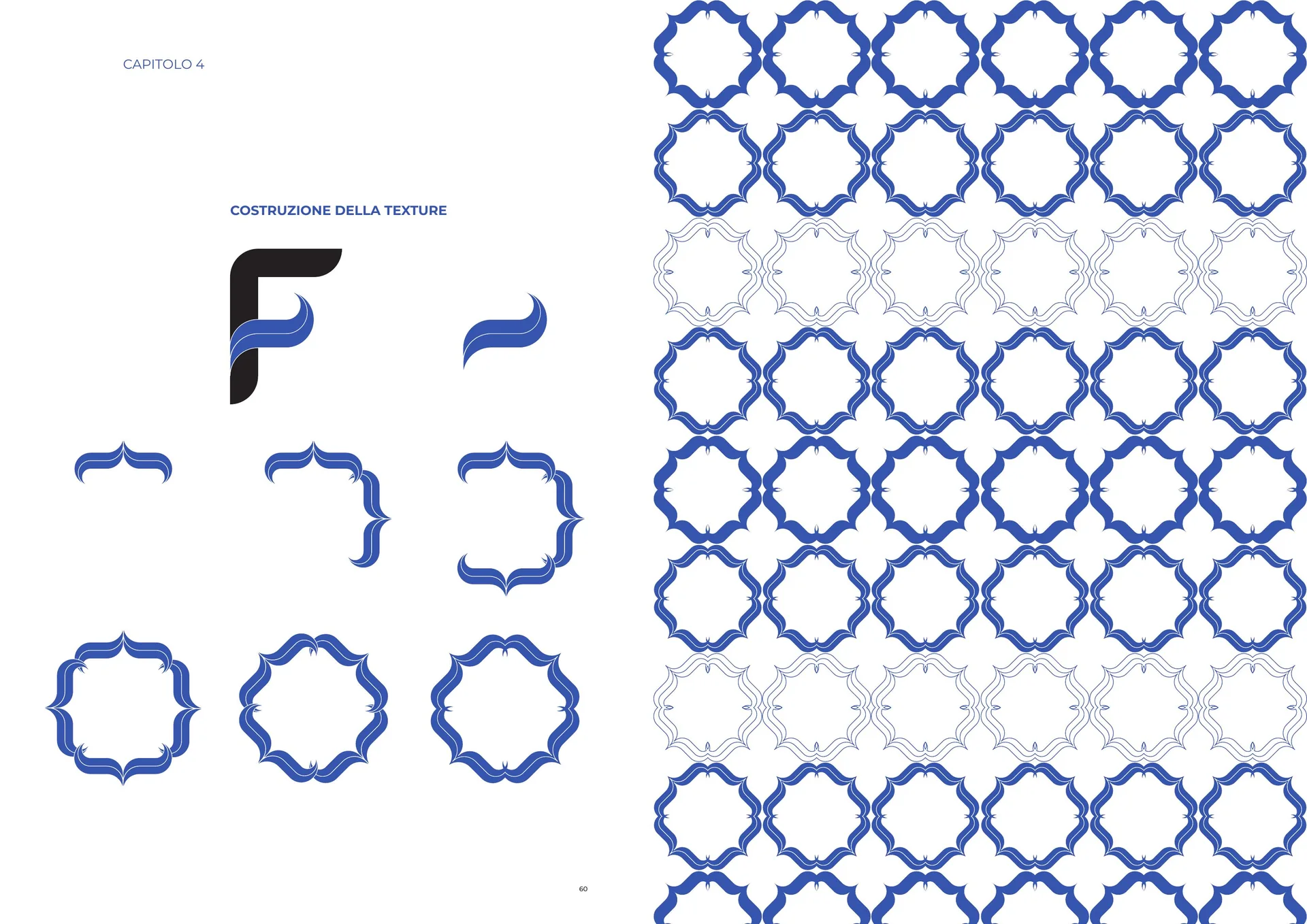
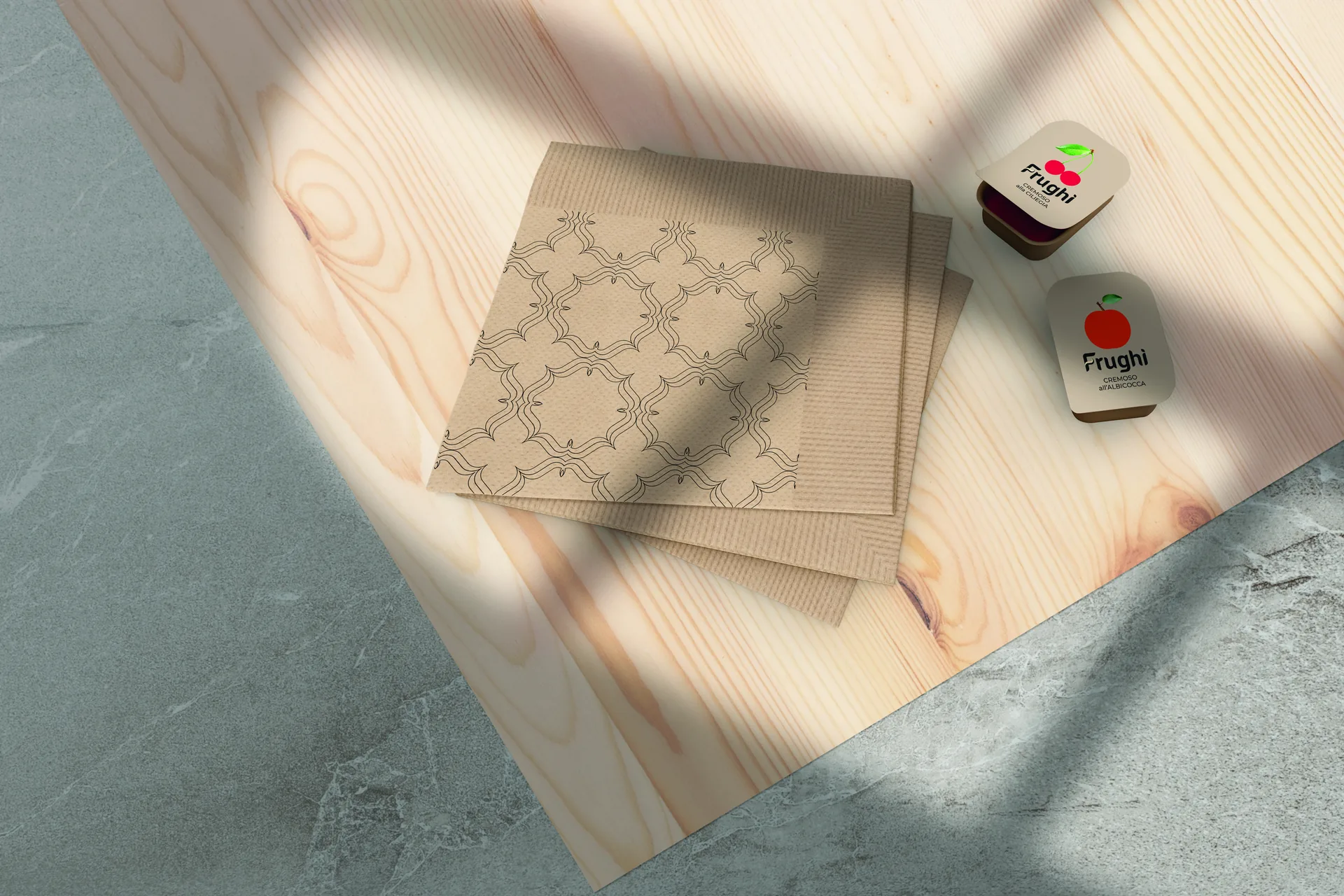
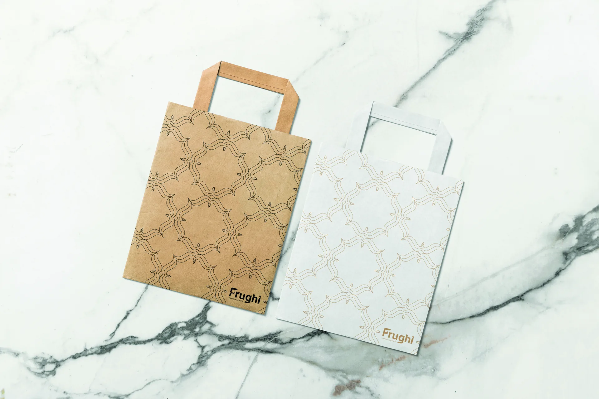
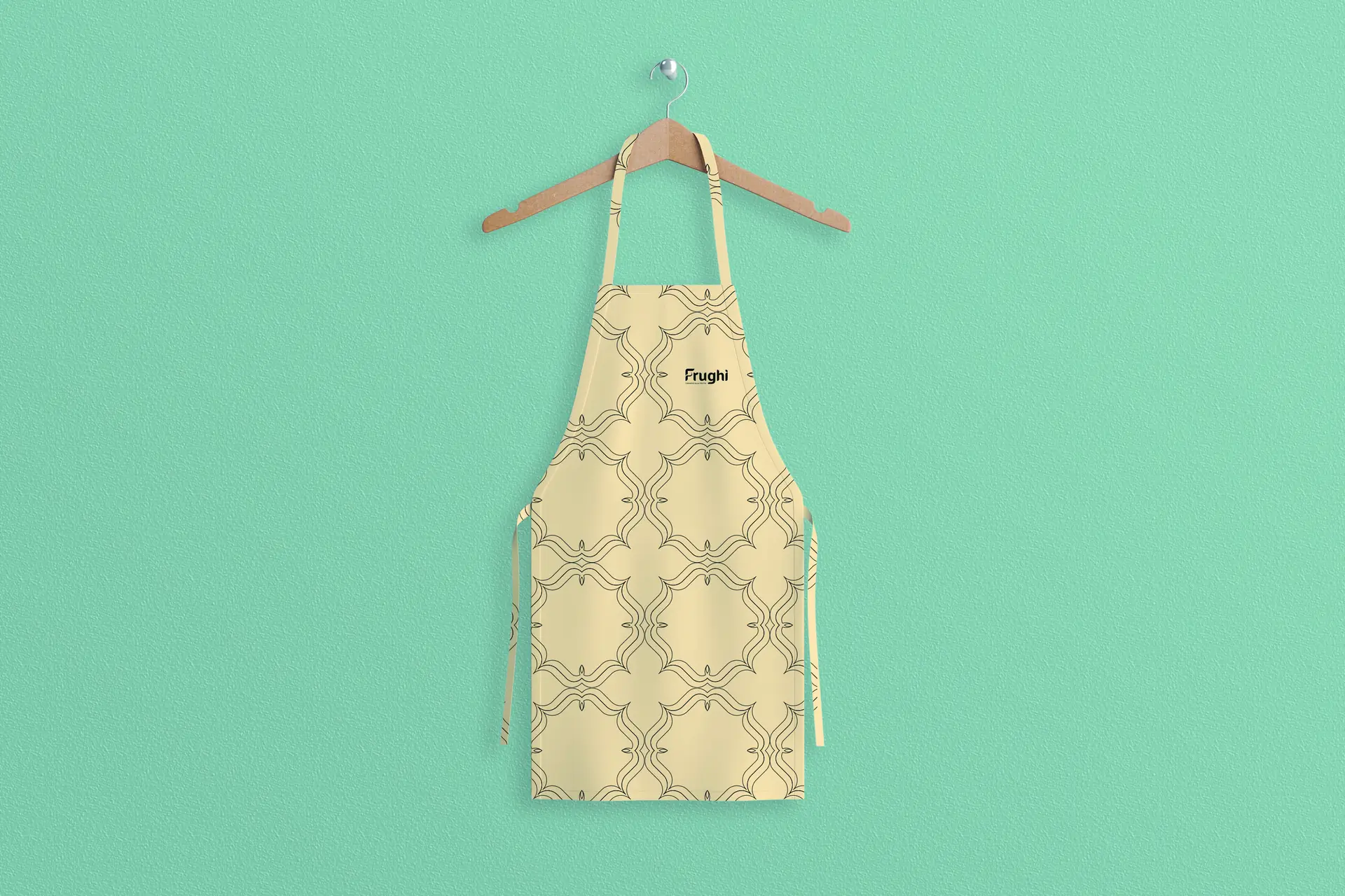
The texture is the F's tie, repeated. Two curves side by side make an arch, eight arches close a rosette, and rosettes hooked by their points fill the surface. It goes on the large surfaces where the mark alone would stay a postage stamp: the paper bag, the apron, the cover of the volume, the sides of the boxes.
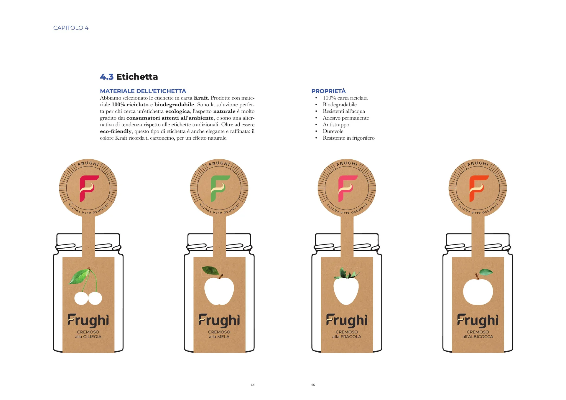
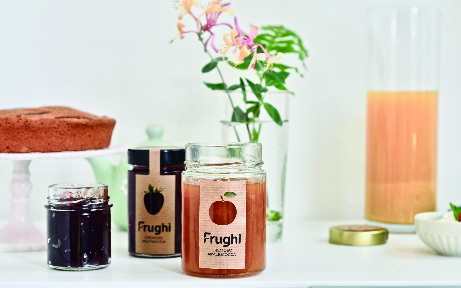
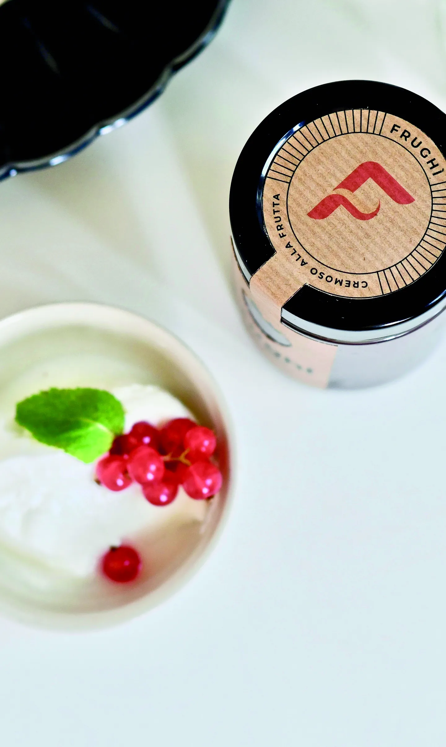
The label is on recycled Kraft paper, biodegradable and resistant to water and to the cold of the fridge. The fruit is cut out in negative: where the paper ends, you see the real colour of the product inside the glass, so the same label changes by itself from cherry to apricot. The flavour name sits under the logotype, on two lines, with the fruit word in capitals.
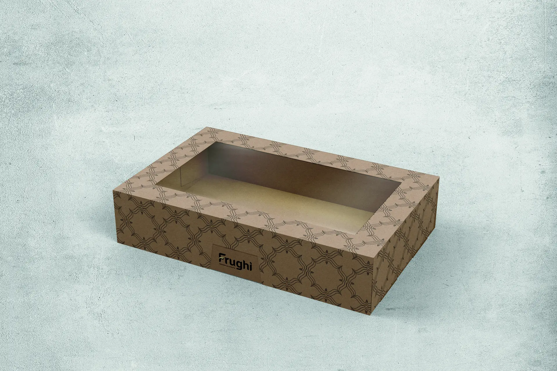
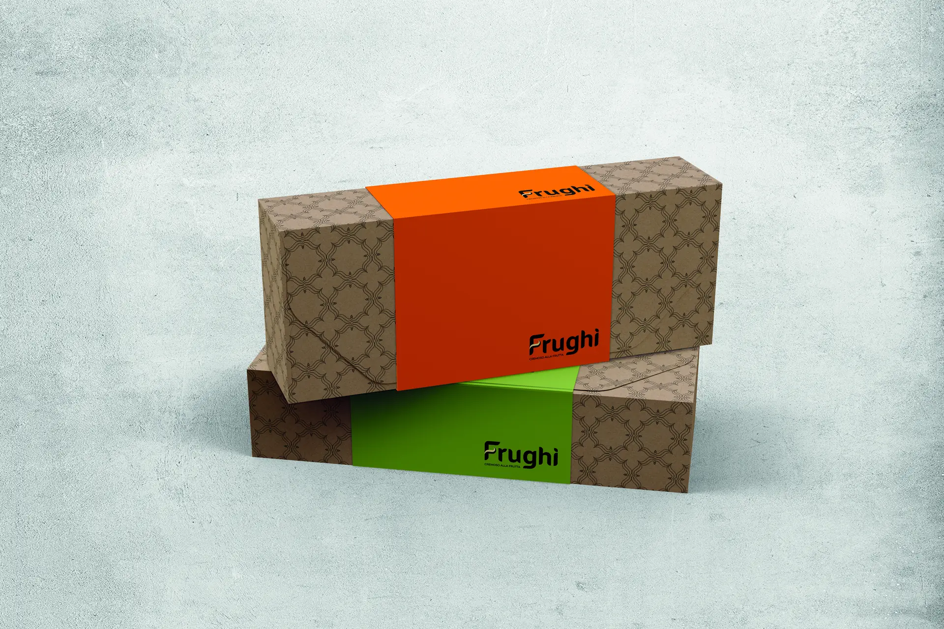
There are two packages, and they don't do the same job. The shop one keeps the jars behind a window, because there the product is sold by looking at it. The one sent to influencers covers them completely and puts a band of solid colour in place of the window: the colour tells the flavour before the box is opened.
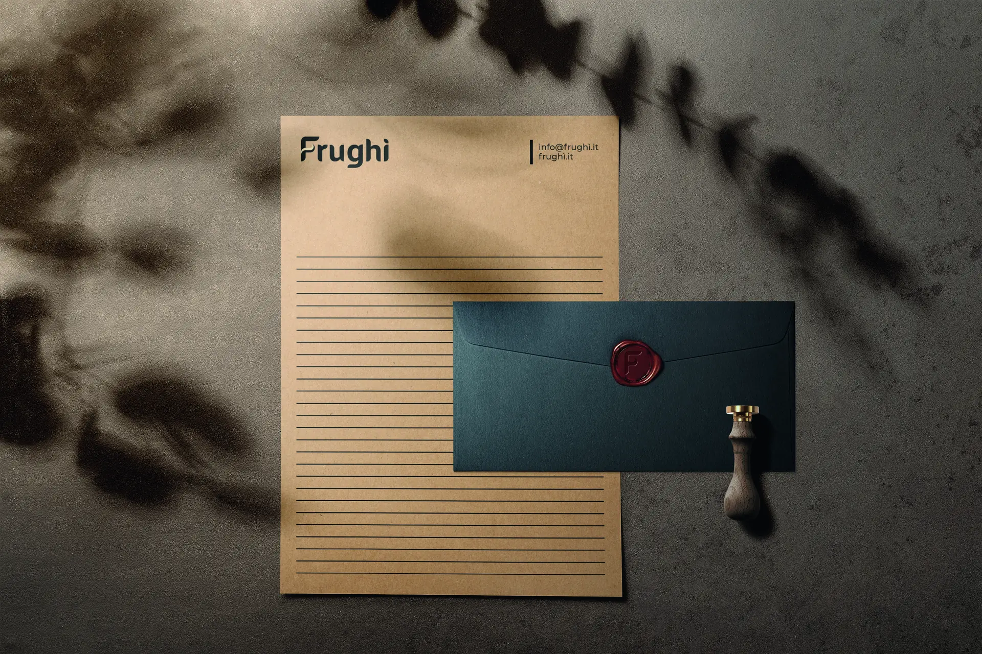
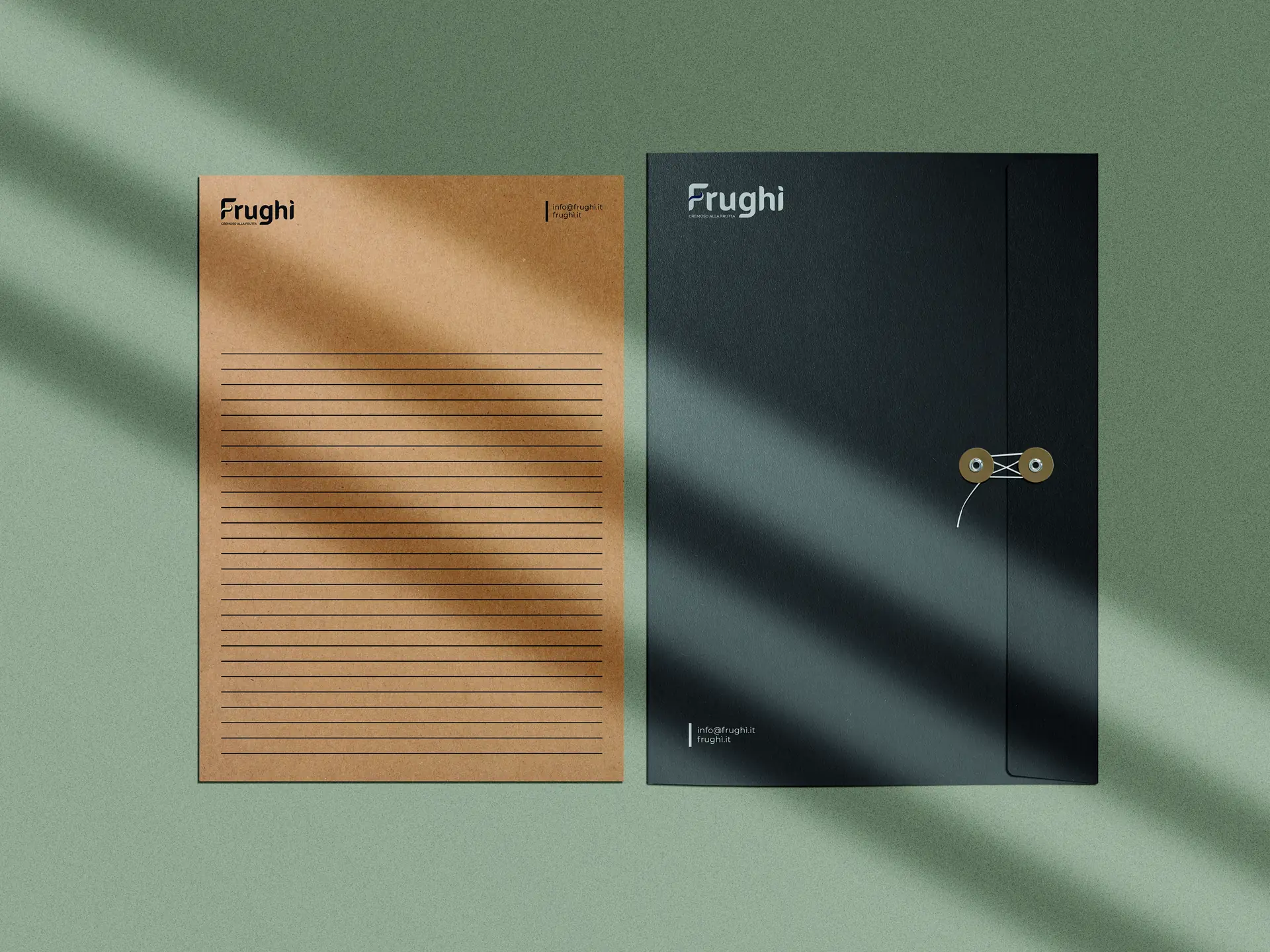
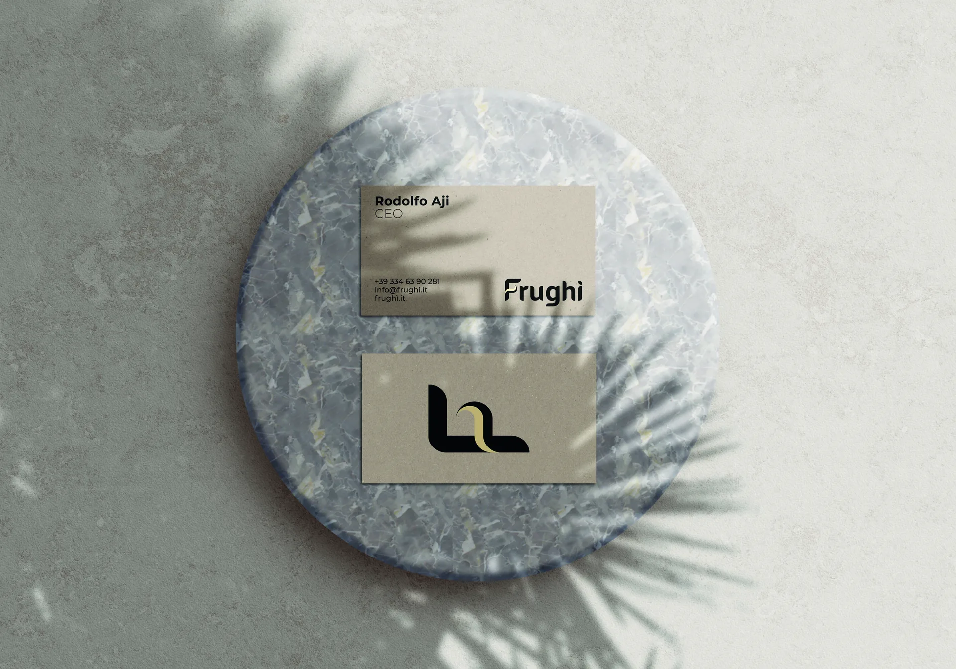
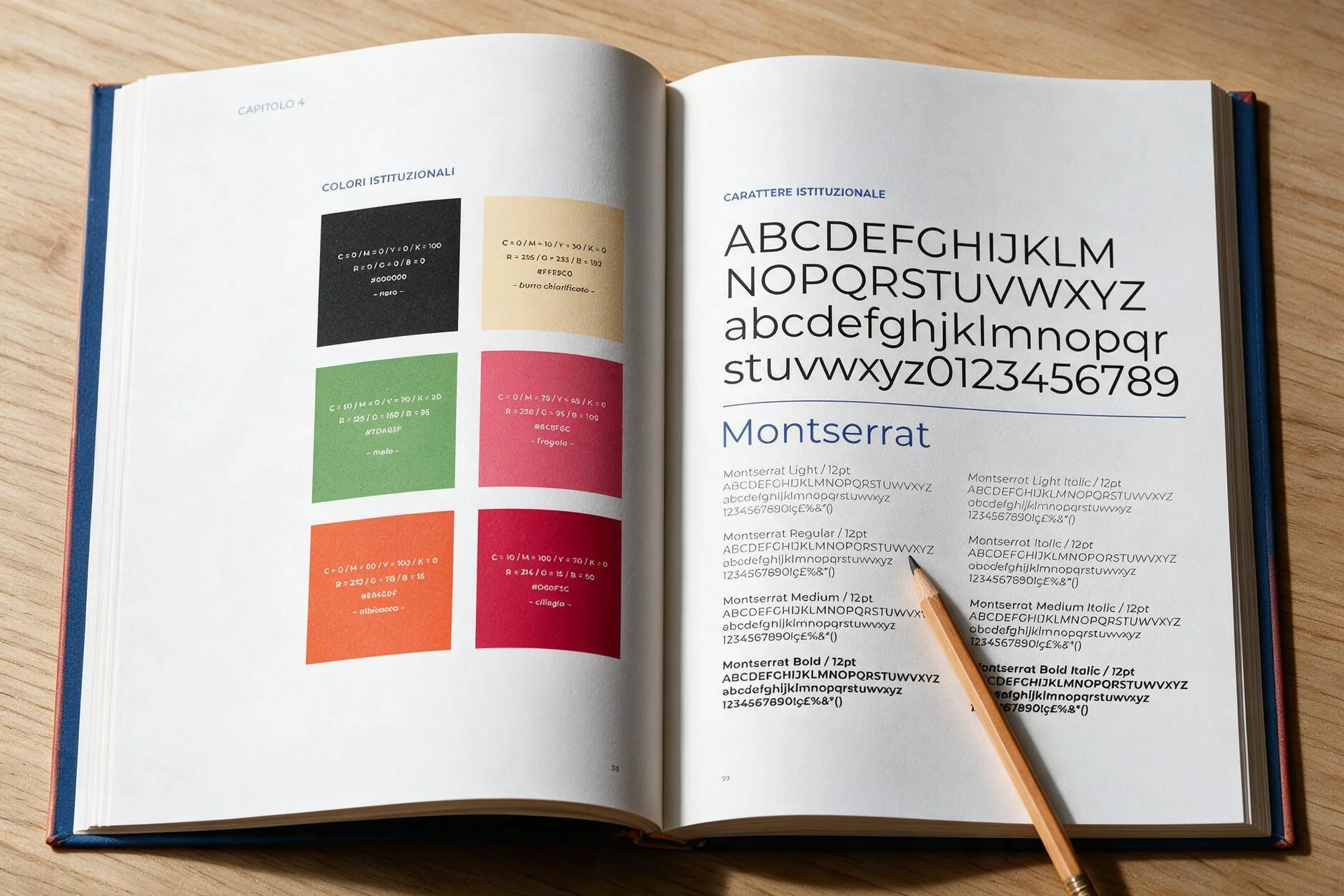
On the stationery the mark tones down: black on Kraft, without the fruit colours, which stay with the product. The only exception is the sealing-wax stamp on the envelope, where the F is in relief and the red comes from the wax. The text typeface is Montserrat, in the eight weights listed in the manual.
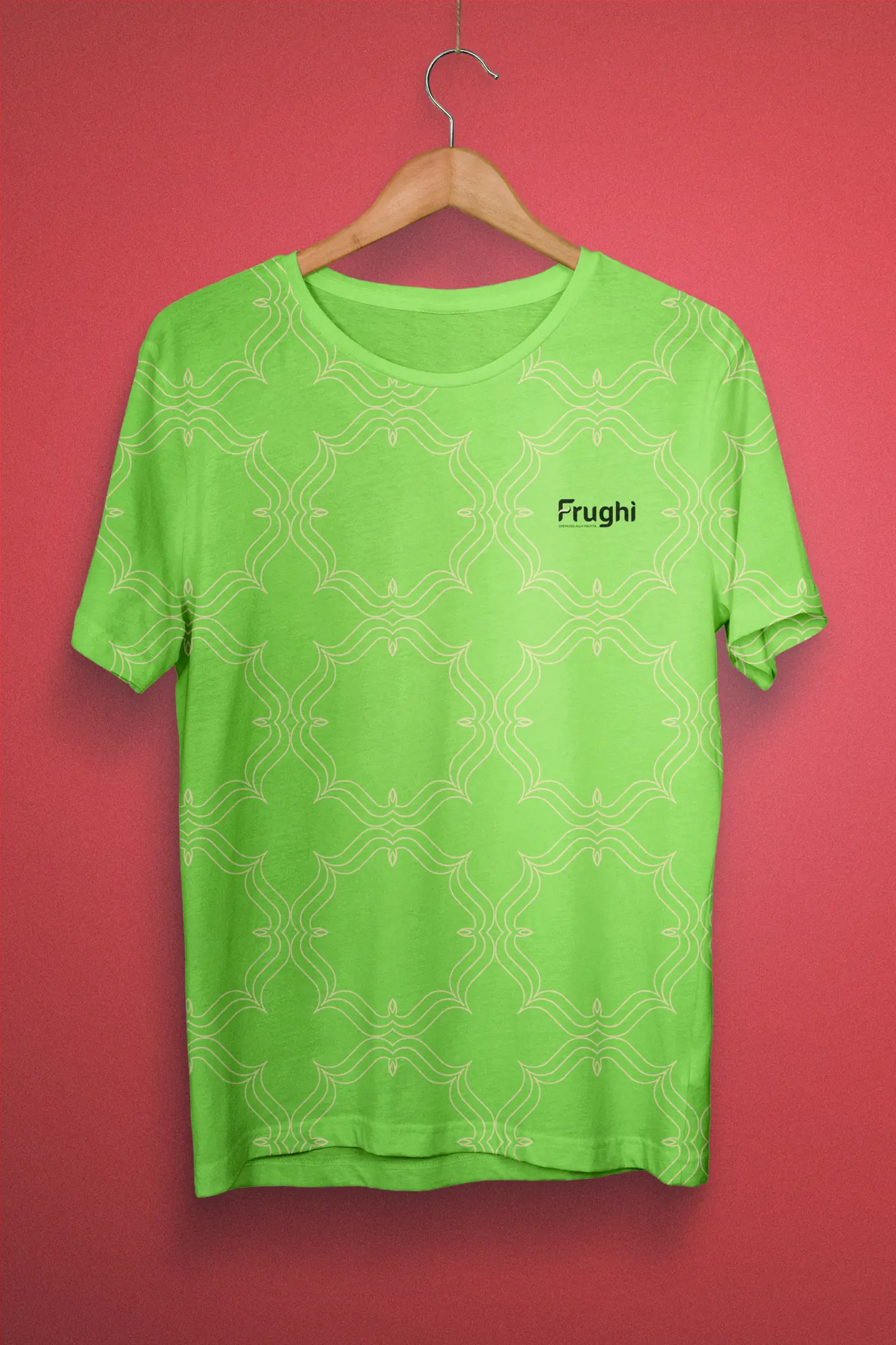
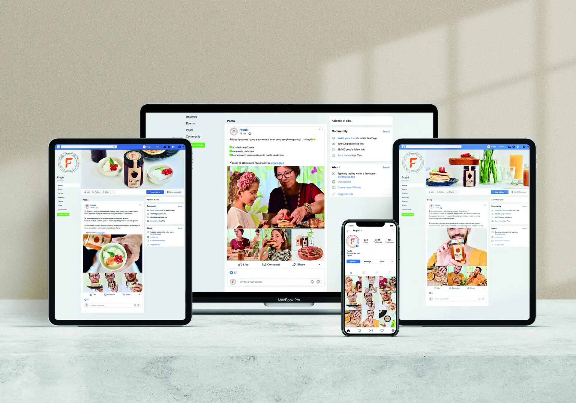
The editorial plan that accompanies the relaunch counts three posts a week across Instagram and Facebook, with extra posts tied to tastings, trade fairs and company visits. I delivered mark and logotype in positive, negative, colour and black-and-white versions, with reduction tests down to two and a half centimetres, the six colours with formulas for print and screen, the texture, the four labels, the two packages, the correspondence stationery and the merchandising pieces.
More projects
013 — more projects- 001EntixBrand · Web · Product
- 002NutrinsectPackaging · Web · Print
- 004Processing Community DayBrand identity
- 005Natale in città 2023Brand · Campaign
- 006La Grande GuerraBrand identity
- 007Ancona RespiraBrand identity
- 008Io Sono Il ParcoBrand identity
- 009Tecla SystemBrand identity
- 010Moda ImmagineBrand identity
- 011Sicilian ElementPublishing
- 012SnowsnapPublishing
- 013VentunoPublishing
- 014Noris CocciWeb design