—
Studio Legale Biocca
Website
Graphic design · WordPress · Elementor
—
Studio Legale Biocca was founded in 1992 and works from three offices, Pescara, Teramo and Milan, for banks, SPVs, servicers, leasing companies and investment funds, mostly on non-performing credit and business crises. The website lines up what an institutional client needs to know straight away: how long the firm has existed, where its offices are, which operations it handles and in which regions. I did the graphic design and built it on WordPress with Elementor.
The entrance
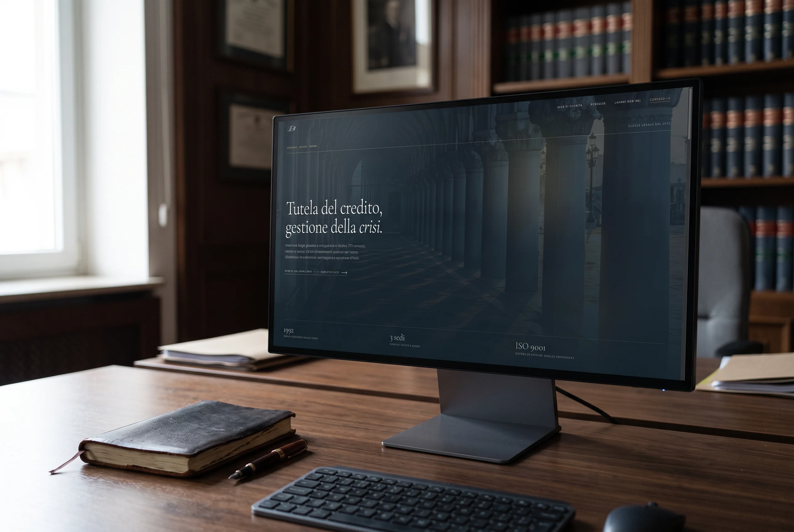
The first screen is dark: the SLB monogram appears with a thin rule under it, then the page opens on a colonnade in half-light. The headline, in a large serif with the word “crisi” in italics, sits on the left; below it, three figures — 1992, three offices, ISO 9001 — say in one line who the firm is.
Colours and type
Two typefaces: Cormorant Garamond for the headings and Hanken Grotesk for text and labels. Three colours: the deep petrol blue of the dark background, the ivory of the reading sections and a warm gold used for labels, thin rules and links, which guides the eye without decorating.
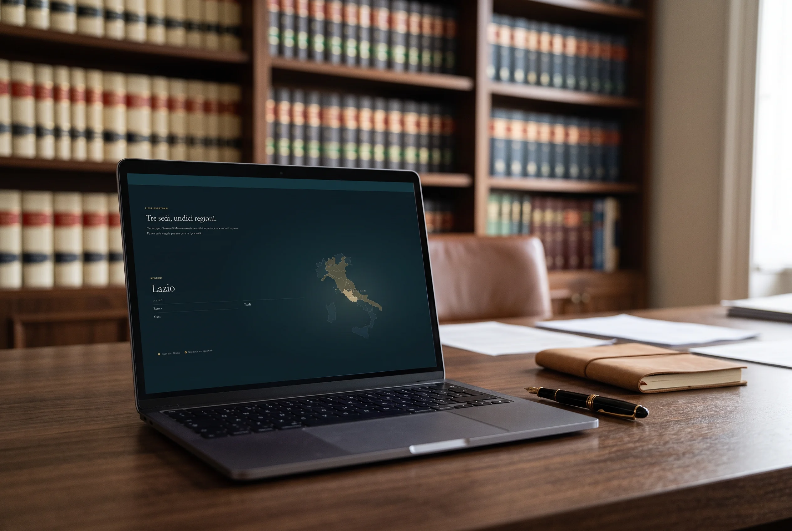
The “Tre sedi, undici regioni” section is a map of Italy: the regions where the firm operates are highlighted and, with the cursor over a region or a tap on the phone, the list of cities appears on the left, from Genoa to Bari. If nobody touches it, it moves on its own from one region to the next. The three offices have their own marker. It gives an idea of the firm’s reach without a table to read.
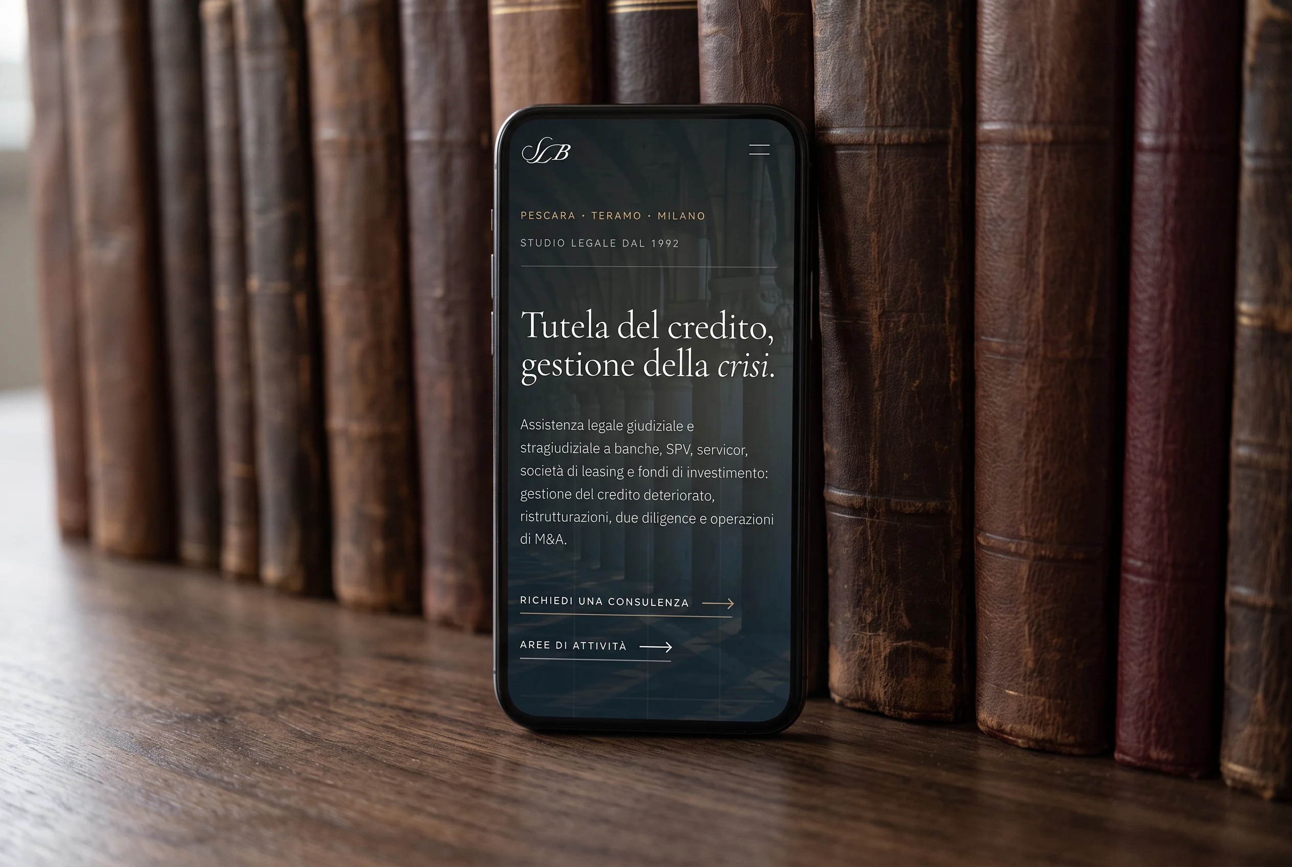
On the phone the menu becomes an icon and the sections stack in one column; the headline stays on two lines and the two entrance buttons sit one under the other.
More projects
014 — more projects- 001EntixBrand · Web · Product
- 002NutrinsectPackaging · Web · Print
- 003FrughìBrand · Packaging
- 004Processing Community DayBrand identity
- 005Natale in città 2023Brand · Campaign
- 006La Grande GuerraBrand identity
- 007Ancona RespiraBrand identity
- 008Io Sono Il ParcoBrand identity
- 009Tecla SystemBrand identity
- 010Moda ImmagineBrand identity
- 011Sicilian ElementPublishing
- 012SnowsnapPublishing
- 013VentunoPublishing
- 014Noris CocciWeb design