—
Plot Books
Dynamic visual identity and website
Branding · Web design · E-commerce
—
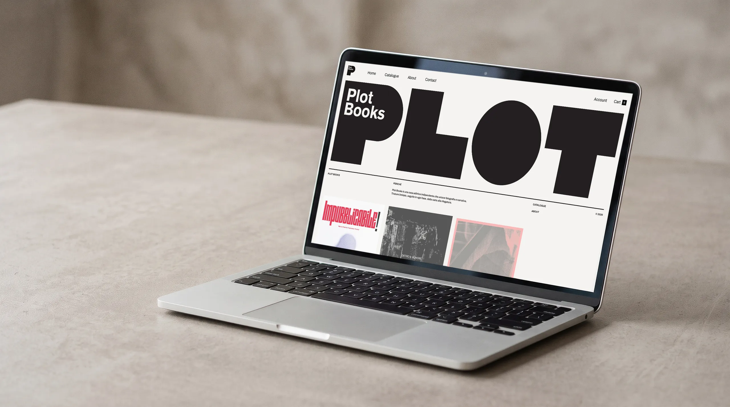
Plot Books is an independent publishing house for photography and fiction, founded by Noris Cocci and Stefano Squarcia. I designed the mark and its visual system, then built the website on WordPress and the shop with WooCommerce. The mark has no image of its own: it takes the ones from the books, and changes with the catalogue.

The mark
PLOT is written with four simple shapes: a P with a round belly, a stepped L, a circle, a T. The name sits inside the P, in white. At rest it is all black on a warm light ground, with no other colours: those come from the books. Plot means a piece of land and also a storyline, and the four letters are four pieces of surface ready to take an image.
The letters
Each letter is a window. Move over it and it fills with a photograph taken from the books in the catalogue, cropped to the shape: a road sign in the P, a staircase in the L, a backstage table in the O, a guitarist in the T. Move over again and another one arrives. The mark changes at every pass.
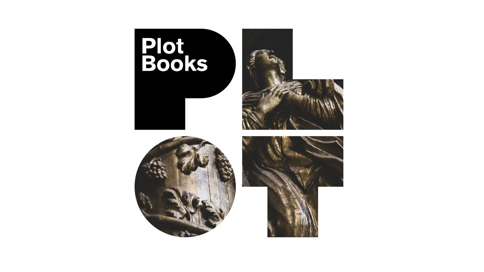
The mark shows up before the site does. While the pages load, only the P is left, in the centre, with a photograph inside the curve and the name in white; at the bottom left a large number counts the progress. It happens only on the first page of a visit: after that, you go straight in.
The catalogue
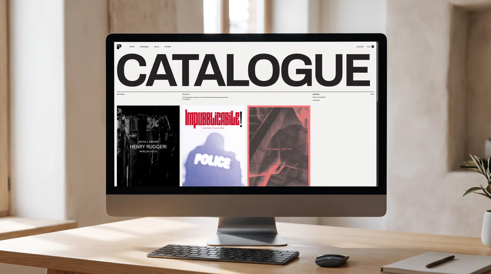
Every page opens with its own title set large, full width, like PLOT: Catalogue, About. Below, the covers in a grid with filters by collection. Moving over a cover brings up a photograph from inside the book.
The book page
Here the shop and the technical sheet live on the same page. On the left the cover and the photographs, on the right price, availability and description; below, a ruled table with author, texts, editing, graphic design, format, pages, languages, printing technique, print run, ISBN. Cart and account are WooCommerce's.
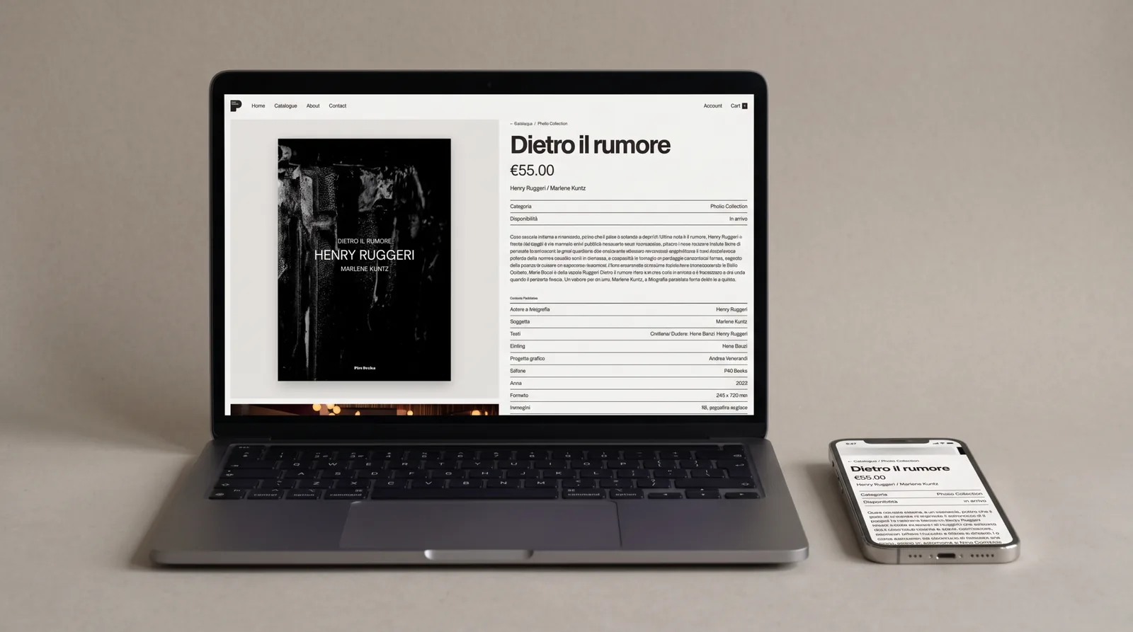
The typeface is Archivo, heavy and huge in the titles, small and dense in the data. On the phone the site doesn't change its mind: the four letters stay in a row, the covers go two per row. Dietro il rumore and Ventuno, in the catalogue, I designed myself.
The business card
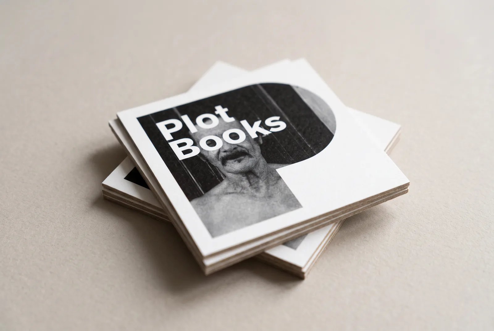
The card is a 5.5 cm square. The P fills the whole face, with a photograph inside the curve and the name in white. The pictogram holds up on its own, without the other three letters.
Logo and pictogram
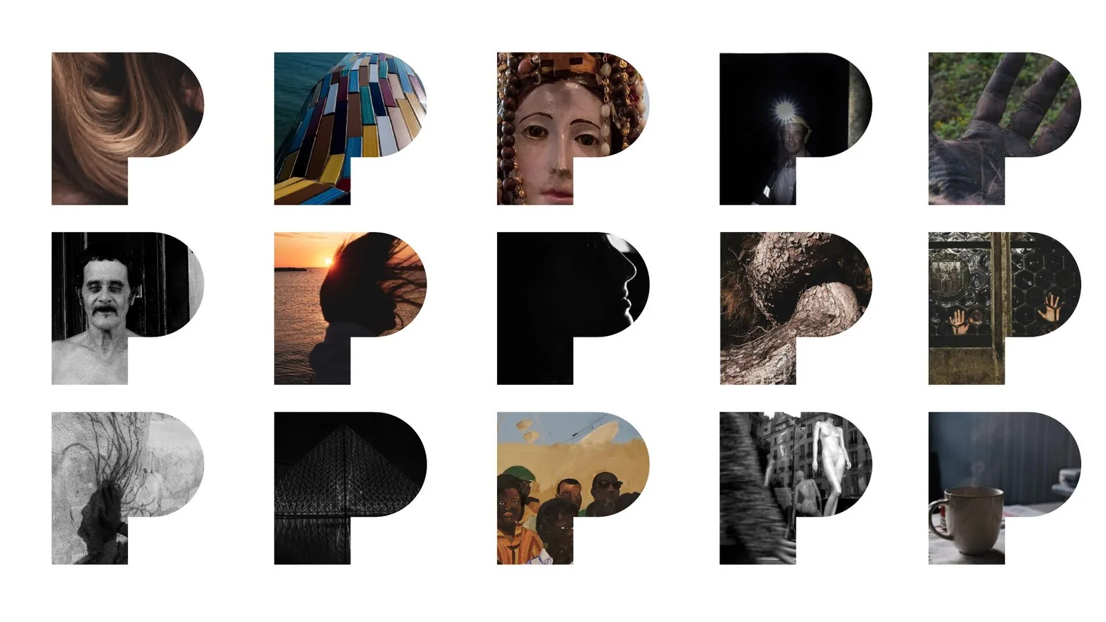
The name can sit on its own, inside the P or inside any of the other letters, and the four letters can run in a row or sit in a square. The P detaches from the rest and becomes a pictogram: a frame for a photograph, a different one every time.
More projects
015 — more projects- 001EntixBrand · Web · Product
- 002NutrinsectPackaging · Web · Print
- 003FrughìBrand · Packaging
- 004Processing Community DayBrand identity
- 005Natale in città 2023Brand · Campaign
- 006La Grande GuerraBrand identity
- 007Ancona RespiraBrand identity
- 008Io Sono Il ParcoBrand identity
- 009Tecla SystemBrand identity
- 010Moda ImmagineBrand identity
- 011Sicilian ElementPublishing
- 012SnowsnapPublishing
- 013VentunoPublishing
- 014Noris CocciWeb design
- 015Studio Legale BioccaWeb design